I am from 17 Year to learn Python And data analysis , Along the way , There is no particularly suitable book , I've seen a lot , But most of them are scattered , At the end of the article, a set of PythonPDF Book tutorial , Dear friends You can study hard !
Explore charts with visualization
One 、 Data visualization and exploration diagram
Data visualization refers to the presentation of data in the form of graphics or tables . The chart can clearly show the nature of the data , And the relationship between data or attributes , It's easy for people to see the picture and interpret . Users explore the map (Exploratory Graph) You can understand the characteristics of data 、 Look for trends in data 、 Lower the threshold of data understanding .
Two 、 Common chart examples
This chapter mainly adopts Pandas The way to draw , Instead of using Matplotlib modular . Actually Pandas Have the Matplotlib The drawing method is integrated into DataFrame in , So in practice , Users do not need to directly reference Matplotlib You can also complete the work of drawing .
1. Broken line diagram
Broken line diagram (line chart) Is the most basic chart , It can be used to present the relationship between continuous data in different fields . The line chart is drawn using plot.line() Methods , You can set the color 、 Shape and other parameters . On the use , The drawing method of line drawing completely inherits Matplotlib Usage of , So the program must finally call plt.show() Production graph , Pictured 8.4 Shown .
df_iris[['sepal length (cm)']].plot.line()
plt.show()
ax = df[['sepal length (cm)']].plot.line(color='green',title="Demo",style='--')
ax.set(xlabel="index", ylabel="length")
plt.show()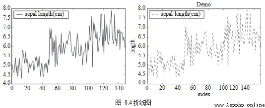
2. Scatter map
Scatter map (Scatter Chart) Used to view the relationship between discrete data in different fields . Scatter charts are drawn using df.plot.scatter(), Pictured 8.5 Shown .
df = df_iris
df.plot.scatter(x='sepal length (cm)', y='sepal width (cm)')
from matplotlib import cm
cmap = cm.get_cmap('Spectral')
df.plot.scatter(x='sepal length (cm)',
          y='sepal width (cm)',
          s=df[['petal length (cm)']]*20,
          c=df['target'],
          cmap=cmap,
          title='different circle size by petal length (cm)')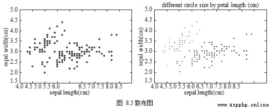
3. Histogram 、 bar chart
Histogram (Histogram Chart) Usually used in the same field , Present the distribution of continuous data , Another kind of graph similar to histogram is long bar graph (Bar Chart), Used to view the same field , Pictured 8.6 Shown .
df[['sepal length (cm)', 'sepal width (cm)', 'petal length (cm)','petal width (cm)']].plot.hist()
2 df.target.value_counts().plot.bar()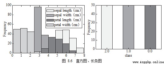
4. Pie chart 、 Box chart
Pie chart (Pie Chart) It can be used to view the proportion of each category in the same field , Box diagram (Box Chart) It is used to view the same field or compare the distribution differences of data in different fields , Pictured 8.7 Shown .
df.target.value_counts().plot.pie(legend=True)
df.boxplot(column=['target'],figsize=(10,5))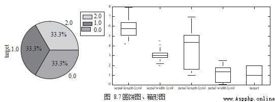
Data exploration and actual combat sharing
This section uses two real data sets to show several methods of data exploration .
One 、2013 American community survey
Community surveys in the United States (American Community Survey) in , About every year 350 Million families were asked detailed questions about who they are and how they live . The survey covered many topics , Including ancestors 、 education 、 Work 、 traffic 、 Internet use and residence .
Data sources :https://www.kaggle.com/census/2013-american-community-survey.
Data name :2013 American Community Survey.
First observe the appearance and characteristics of the data , And the meaning of each field 、 Type and scope .
#  Reading data
df = pd.read_csv("./ss13husa.csv")
#  Type and quantity of fields
df.shape
# (756065,231)
#  Field value range
df.describe()
The first two ss13pusa.csv String together , This data contains a total of 30 Ten thousand data ,3 Fields :SCHL ( Education ,School Level)、 PINCP ( income ,Income) and ESR ( Working state ,Work Status).
pusa = pd.read_csv("ss13pusa.csv") pusb = pd.read_csv("ss13pusb.csv")
#  Connect two data in series
col = ['SCHL','PINCP','ESR']
df['ac_survey'] = pd.concat([pusa[col],pusb[col],axis=0)
Group the data according to educational background , Observe the number and proportion of different degrees , Then calculate their average income .
group = df['ac_survey'].groupby(by=['SCHL']) print(' Education distribution :' + group.size())
group = ac_survey.groupby(by=['SCHL']) print(' Average income :' +group.mean())
Two 、 Boston housing data set
Boston housing data set (Boston House Price Dataset) Contains information about houses in the Boston area , package 506 Data samples and 13 Characteristic dimensions .
Data sources :https://archive.ics.uci.edu/ml/machine-learning-databases/housing/.
Data name :Boston House Price Dataset.
First observe the appearance and characteristics of the data , And the meaning of each field 、 Type and scope .
You can use histogram to draw house prices (MEDV) The distribution of , Pictured 8.8 Shown .
df = pd.read_csv("./housing.data")
#  Type and quantity of fields
df.shape
# (506, 14)
# Field value range df.describe()
import matplotlib.pyplot as plt
df[['MEDV']].plot.hist()
plt.show()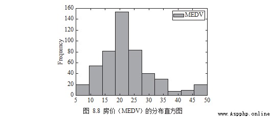
notes : The Chinese and English in the figure correspond to the name specified by the author in the code or data , In practice, readers can replace them with the words they need .
The next thing you need to know is which dimensions are related to “ housing price ” The relationship is obvious . Let's look at... In the form of a scatter diagram , Pictured 8.9 Shown .
# draw scatter chart
df.plot.scatter(x='MEDV', y='RM') .
plt.show()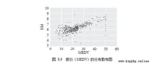
Last , Calculate the correlation coefficient and use the cluster heat map (Heatmap) For visual presentation , Pictured 8.10 Shown .
# compute pearson correlation
corr = df.corr()
# draw  heatmap
import seaborn as sns
corr = df.corr()
sns.heatmap(corr)
plt.show()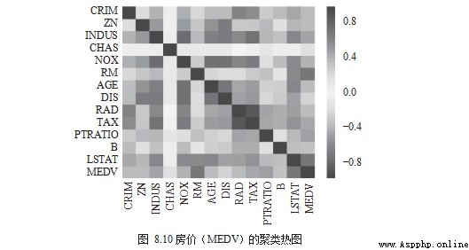
The color is red , Indicates a positive relationship ; The color is blue , Indicates a negative relationship ; The color is white , It doesn't matter .RM The correlation with house prices tends to be red , It is a positive relationship ;LSTAT、PTRATIO The correlation with house prices tends to dark blue , Is a negative relationship ;CRIM、RAD、AGE The correlation with house prices tends to be white , It doesn't matter .
more Python See the following practice for technical knowledge PDF electronic text Download this

Python actual combat PDF Download this