# Font settings
plt.rcParams['font.sans-serif'] = ["SimHei"]
plt.rcParams["axes.unicode_minus"] = False
Matplotlib: It's a Python Of 2D Drawing library , adopt Matplotlib, Developers can only need a few lines of code , You can generate a line chart , Histogram , Bar chart , The pie chart , Scatter plot, etc. .plot Is a drawing function , His parameters :plot([x],y,[fmt],data=None,**kwargs)
(1) Dotted line form
(2) line color
import matplotlib.pyplot as plt
import numpy as np
# Original line diagram
plt.plot(range(10),[np.random.randint(0,10) for x in range(10)])
# Point line diagram
plt.plot(range(10),[np.random.randint(0,10) for x in range(10)],"*")
# line color
plt.plot([1,2,3,4,5],[1,2,3,4,5],'r') # Set the color line to red
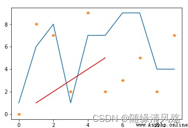
1、 Set chart title :plt.title
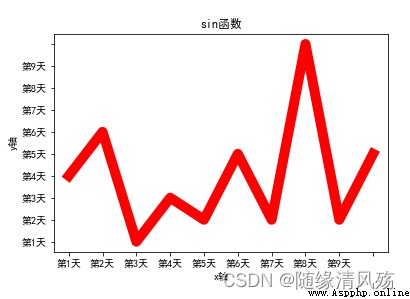
2、 Set axis title :plt.xlabel & plt.ylabel - Title Title
3、 Set the axis scale :plt.xticks & plt.yticks - The length of the scale , Scale title
x = range(10)
y = [np.random.randint(0,10) for x in range(10)]
plt.plot(x,y,linewidth=10,color='red')
# Set chart title
plt.title("sin function ")
# Set axis title
plt.xlabel("x Axis ")
plt.ylabel("y Axis ")
# Set the axis scale
plt.xticks(range(10),[" The first %d God "%x for x in range(1,10)])
plt.yticks(range(10),[" The first %d God "%x for x in range(1,10)])
# Load Fonts
plt.rcParams['font.sans-serif'] = ["SimHei"]
plt.rcParams["axes.unicode_minus"] = False
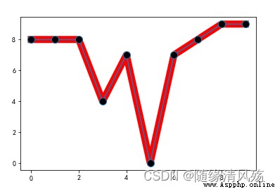
marker: Key point accent mark
x = range(10)
y = [np.random.randint(0,10) for x in range(10)]
plt.plot(x,y,linewidth=10,color='red')
# Key marks
plt.plot(x,y,marker="o",markerfacecolor='k',markersize=10)
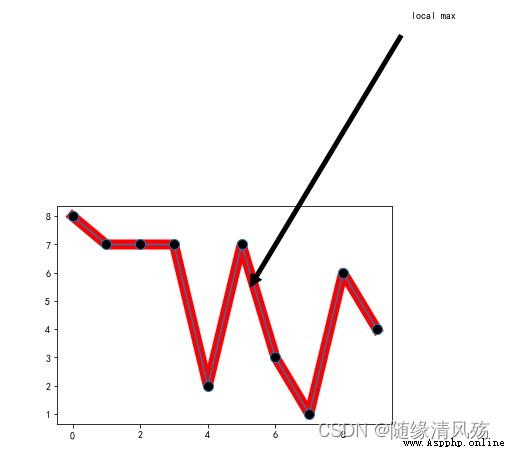
annotate: Annotated text
x = range(10)
y = [np.random.randint(0,10) for x in range(10)]
plt.plot(x,y,linewidth=10,color='red')
# Key marks
plt.plot(x,y,marker="o",markerfacecolor='k',markersize=10)
# Note text settings
plt.annotate('local max', xy=(5, 5), xytext=(10,15),
arrowprops=dict(facecolor='black',shrink=0.05),
)
plt.figure: Adjust the size and pixels of the picture
`num`: The number of the drawing ,
`figsize`: It's in inches ,
`dpi`: Pixels per inch ,
`facecolor`: Picture background color ,
`edgecolor`: Border color ,
`frameon`: Whether to draw drawing board .
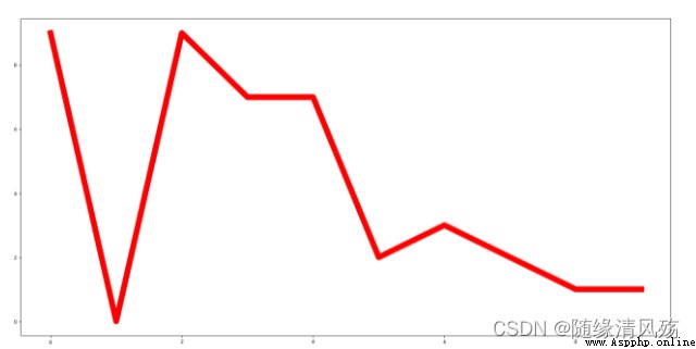
x = range(10)
y = [np.random.randint(0,10) for x in range(10)]
# Set up graphic styles
plt.figure(figsize=(20,10),dpi=80)
plt.plot(x,y,linewidth=10,color='red')
1. Quantity statistics .
2. frequency count .
barh: Bar chart
1. `x`: An array or list , Representing the bar graph that needs to be drawn x The coordinate point of the axis .
2. `height`: An array or list , Represents the bar graph that needs to be drawn y The coordinate point of the axis .
3. `width`: The width of each bar , The default is 0.8 Width .
4. `bottom`:`y` The baseline of the axis , The default is 0, That is, the distance from the bottom is 0.
5. `align`: Alignment mode , The default is `center`, That is to say, with the designated `x` The coordinates are centered , And for `edge`, Edge alignment , Right or left , see `width` Plus or minus .
6. `color`: The color of the bar graph .
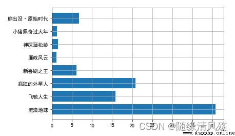
movies = {

" Wandering the earth ":40.78,
" Fast life ":15.77,
" Crazy aliens ":20.83,
" The king of new comedy ":6.10,
" Integrity ":1.10,
" Detective Pu Songling ":1.49,
" Peppa pig has a big year ":1.22,
" Bear haunt · primeval ages ":6.71
}
plt.barh(np.arange(len(movies)),list(movies.values()))
plt.yticks(np.arange(len(movies)),list(movies.keys()),fontproperties=font)
plt.grid()
2.2、 Grouped bars
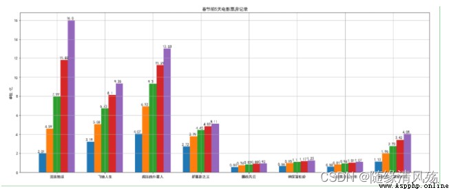
movies = {

" Wandering the earth ":[2.01,4.59,7.99,11.83,16],
" Fast life ":[3.19,5.08,6.73,8.10,9.35],
" Crazy aliens ":[4.07,6.92,9.30,11.29,13.03],
" The king of new comedy ":[2.72,3.79,4.45,4.83,5.11],
" Integrity ":[0.56,0.74,0.83,0.88,0.92],
" Detective Pu Songling ":[0.66,0.95,1.10,1.17,1.23],
" Peppa pig has a big year ":[0.58,0.81,0.94,1.01,1.07],
" Bear haunt · primeval ages ":[1.13,1.96,2.73,3.42,4.05]
}
plt.figure(figsize=(20,8))
width = 0.75
bin_width = width/5
movie_pd = pd.DataFrame(movies)
ind = np.arange(0,len(movies))
# First option
for index in movie_pd.index:
day_tickets = movie_pd.iloc[index]
xs = ind-(bin_width*(2-index))
plt.bar(xs,day_tickets,width=bin_width,label=" The first %d God "%(index+1))
for ticket,x in zip(day_tickets,xs):
plt.annotate(ticket,xy=(x,ticket),xytext=(x-0.1,ticket+0.1))
# Set legend
plt.ylabel(" Company : Billion ")
plt.title(" Before the Spring Festival 5 Days movie box office record ")
# Set up x Axis coordinates
plt.xticks(ind,movie_pd.columns)
plt.xlim
plt.grid(True)
plt.show()
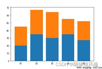
menMeans = (20, 35, 30, 35, 27)
womenMeans = (25, 32, 34, 20, 25)
groupNames = ('G1','G2','G3','G4','G5')
xs = np.arange(len(menMeans))
plt.bar(xs,menMeans)
plt.bar(xs,womenMeans,bottom=menMeans)
plt.xticks(xs,groupNames)
plt.show()
plt.hist: Histogram
1. x: Arrays or sequences that can loop ;
2. bins: Numbers or sequences ( Array / List etc. );
3. range: Tuples or None, If it's a tuple , The specified `x` Divide the maximum and minimum of the interval ;
4. density: The default is `False`, If it is equal to `True`, Then we'll use the frequency distribution histogram ;
5. cumulative: If this and `density` All equal to `True`, Then the first parameter of the return value will continue to accumulate , In the end, it's equal to `1`.
1. Display the distribution of data quantity in each group .
2. Used to observe abnormal or isolated data .
3. The number of samples taken is too small , There will be a big error , Low credibility , It's not statistically significant . therefore , The number of samples should not be less than 50 individual .
durations = [131, 98, 125, 131, 124, 139, 131, 117, 128, 108, 135, 138, 131, 102, 107, 114, 119, 128, 121, 142, 127, 130, 124, 101, 110, 116, 117, 110, 128, 128, 115, 99, 136, 126, 134, 95, 138, 117, 111,78, 132, 124, 113, 150, 110, 117, 86, 95, 144, 105, 126, 130,126, 130, 126, 116, 123, 106, 112, 138, 123, 86, 101, 99, 136,123, 117, 119, 105, 137, 123, 128, 125, 104, 109, 134, 125, 127,105, 120, 107, 129, 116, 108, 132, 103, 136, 118, 102, 120, 114,105, 115, 132, 145, 119, 121, 112, 139, 125, 138, 109, 132, 134,156, 106, 117, 127, 144, 139, 139, 119, 140, 83, 110, 102,123,107, 143, 115, 136, 118, 139, 123, 112, 118, 125, 109, 119, 133,112, 114, 122, 109, 106, 123, 116, 131, 127, 115, 118, 112, 135,115, 146, 137, 116, 103, 144, 83, 123, 111, 110, 111, 100, 154,136, 100, 118, 119, 133, 134, 106, 129, 126, 110, 111, 109, 141,120, 117, 106, 149, 122, 122, 110, 118, 127, 121, 114, 125, 126,114, 140, 103, 130, 141, 117, 106, 114, 121, 114, 133, 137, 92,121, 112, 146, 97, 137, 105, 98, 117, 112, 81, 97, 139, 113,134, 106, 144, 110, 137, 137, 111, 104, 117, 100, 111, 101, 110,105, 129, 137, 112, 120, 113, 133, 112, 83, 94, 146, 133, 101,131, 116, 111, 84, 137, 115, 122, 106, 144, 109, 123, 116, 111,111, 133, 150]
plt.figure(figsize=(15,5))
nums,bins,patches = plt.hist(durations,bins=20,edgecolor='k')
plt.xticks(bins,bins)
for num,bin in zip(nums,bins):
plt.annotate(num,xy=(bin,num),xytext=(bin+1.5,num+0.5))
plt.show()
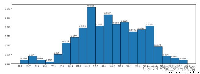
density: Frequency squared distribution diagram
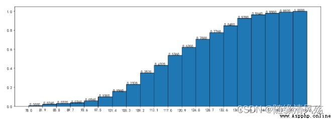
nums,bins,patches = plt.hist(durations,bins=20,edgecolor='k',density=True,cumulative=True)
plt.xticks(bins,bins)
for num,bin in zip(nums,bins):
plt.annotate("%.4f"%num,xy=(bin,num),xytext=(bin+0.2,num+0.0005))

cumulative Parameters :nums The sum of is 1
plt.figure(figsize=(15,5))
nums,bins,patches = plt.hist(durations,bins=20,edgecolor='k',density=True,cumulative=True)
plt.xticks(bins,bins)
for num,bin in zip(nums,bins):
plt.annotate("%.4f"%num,xy=(bin,num),xytext=(bin+0.2,num+0.0005))
plt.scatter: Scatter plot :
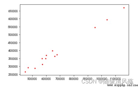
1. x,y: Namely x Axis and y Axis data set . The data length of the two must be the same .
2. s: The size of the point .
3. c: The color of the point .
4. marker: Marker points , The default is dot , You can also change it to something else .
plt.scatter(x =data_month_sum["sumprice"] # Pass in X Variable data
,y=data_month_sum["Quantity"] # Pass in Y Variable data
,marker='*' # The shape of the dot
,s=10 # Size of points
,c='r' # The color of the point
)
plt.show()
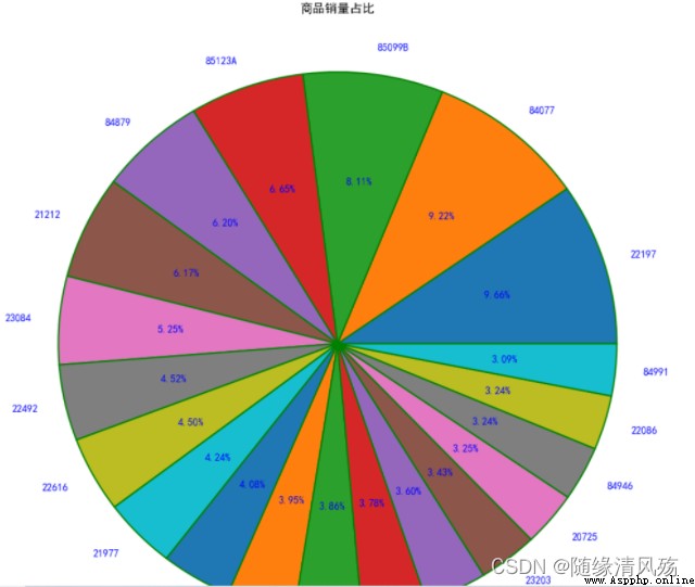
The pie chart : A circular statistical chart divided into several sectors , Used to describe quantities 、 The relative relationship between frequencies or percentages .
stay matplotlib in , Can pass plt.pie To achieve , The parameters are as follows :
x: The scale sequence of the pie chart .labels: The name text of each block on the pie chart .explode: Set whether or not to separate the pie chart for certain blocks .autopct: Set the display mode of proportional text . For example, keep a few decimals and so on .shadow: Show shadows .textprops: Properties of text ( Color , Size, etc ).plt.figure(figsize=(8,8),dpi=100,facecolor='white')
plt.pie(x = StockCode.values, # Data in
radius=1.5, # radius
autopct='%.2f%%' # Percentage display
,pctdistance=0.6, # Percentage distance to center ratio
labels=StockCode.index, # label
labeldistance=1.1, # Scale of label distance from center of circle
wedgeprops ={
'linewidth':1.5,'edgecolor':'green'}, # The width and color of the border
textprops={
'fontsize':10,'color':'blue'}) # Text font size and color
plt.title(' Proportion of commodity sales ',pad=100) # Set the title and the position from the coordinate axis
plt.show()
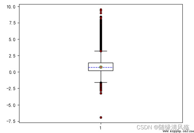
 The drawing method of the box diagram is :
:1、 First, find the upper limit of a set of data 、 Lower limit 、 Median (Q2) And the next quartile (Q1) And the upper quartile (Q3)
:2、 Then connect the two quartiles to draw the box
:3、 Then connect the maximum and minimum values to the box , The median is in the middle of the box .
Median : Sort the data from small to large , Then the middle value is the median , If the number of data is even , Then the average of the two numbers in the middle is the median .
The upper and lower quartiles : Also put the data in order , Divide the data into 4 Share . Appear in the `25%` The position is called the lower quartile , Appear in the `75%` The number in position is called the upper quartile . But the method of determining the position of the quartile is not fixed , There are several algorithms , The results of each method will be different , But the difference won't be big .
The calculation rule of the upper and lower limits is :
IQR=Q3-Q1
ceiling =Q3+1.5IQR
Lower limit =Q1-1.5IQR
stay matplotlib There is plt.boxplot To draw a box diagram , The parameters of this method are as follows :
x: The data of the box diagram to be drawn .notch: Whether to show the confidence interval , The default is False. If set to True, Then there will be a gap in the box .sym: The symbol representing the outlier indicates , The default is dot .vert: Whether it is vertical , The default is True, If set to False Then show it horizontally .whis: The coefficients of the upper and lower limits , The default is 1.5, That is, the upper limit is Q3+1.5IQR, You can change it to something else . It can also be a sequence , If it's a sequence , Then the two values in the sequence represent the lower limit and the upper limit respectively , Instead of having to pass IQR To calculate .positions: Set the position of each box .widths: Set the width of each box .labels: Every box label.meanline and showmeans: If both are True, Then the line of the average will be drawn .# boxplot - Mainly observe whether the data are abnormal ( outliers )
# Box whisker -75% and 25% Quantile of +/-1.5 Multiple and differential potential difference
plt.figure(figsize=(6.4,4.8),dpi=100)
# Whether to fill the box color , Whether to display the mean value , Whether to display outliers , Box setting , Outliers setting , Mean setting , Median setting
plt.boxplot(x=UnitPrice # Incoming data
,patch_artist=True # Whether to fill the box color
,showmeans=True # Whether to display the mean value
,showfliers=True # Whether to display outliers
,boxprops={
'color':'black','facecolor':'white'} # Box setting
,flierprops={
'marker':'o','markersize':4,'markerfacecolor':'red'} # Outliers setting
,meanprops={
'marker':'o','markersize':6,'markerfacecolor':'indianred'} # Mean setting
,medianprops={
'linestyle':'--','color':'blue'} # Median setting
)
plt.show()
Radar map : It's also called spider web chart , It can be used to show the strength of variables with three or more dimensions
plt.polar To map the radar ,x The coordinates of the axis should be in radians (2*PI=360°)
import numpy as np
properties = [' Output ','KDA',' development ',' Regiment war ',' Existence ']
values = [40,91,44,90,95,40]
theta = np.linspace(0,np.pi*2,6)
plt.polar(theta,values)
plt.xticks(theta,properties)
plt.fill(theta,values)
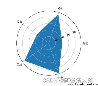
polar It doesn't complete the closed drawing of lines , So we need to draw in theta neutralization values At the end, repeat the addition of the second 0 Value of position , And then when you draw it, you can work with the second 1 The two points are closed .polar Just drawing lines , So if you want to color fill the inside , So you need to call fill Function to implement .polar The default circle coordinates are angles , If we want to change it to text , So you can go through xticks To set up . A treasure cartoon avatar 50 yuan? 1 line of Python code, dont pay IQ tax again
Hello everyone , I am a Python