The first 6 Chapter input control (Entry)
Input control (Entry. Is a control used to input or display a single line string . This control allows the user to enter or display a line of text . If the length of the text entered by the user is greater than Entry Control , The text scrolls backwards . In this case, all the input strings cannot be displayed . You can move the cursor , Move the invisible text part into the visible area . If you want to enter multiple lines of text , You need to use Text Control .
6.1 attribute
6.1.1 Property list
import tkinter as tk
root=tk.Tk()
root.geometry('300x240')
b1=tk.Entry(root,bg='yellow',width=20)
b1.pack()
root.mainloop()
result :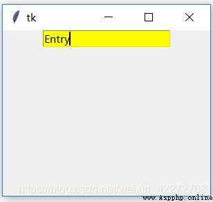
6.1.3 borderwidth(bd)
Set the border width of the input control .bd and borderwidth It does the same thing , It's just an abbreviation .
import tkinter as tk
root=tk.Tk()
root.geometry('300x240')
b1=tk.Entry(root,bg='yellow',width=20,bd=10)
b1.pack()
root.mainloop()
result :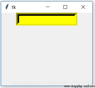
This figure is consistent with 6.1.2 Compare the figures in , You can find , An obvious border appears around the input area . This is the effect of the border .
6.1.4 cursor
When the mouse is in the input control area , The shape of the cursor . It's usually ”I-Beam”. You can also choose other shapes . stay 3.3.6 in , There are detailed names of built-in mouse shapes .
import tkinter as tk
root=tk.Tk()
root.geometry('300x240')
b1=tk.Entry(root,bg='blue',width=20,cursor='mouse')
b1.pack()
root.mainloop()
result :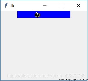
This code is to change the shape of the cursor into a mouse (mouse) shape , Of course, only when the cursor passes through the input control area will it change .
6.1.5 disabledbackground
Input the background color when the control is disabled .
import tkinter as tk
root=tk.Tk()
root.geometry('300x240')
b1=tk.Entry(root,bg='yellow',width=20,
state=tk.DISABLED,disabledbackground='blue')
b1.pack()
root.mainloop()
result :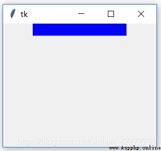
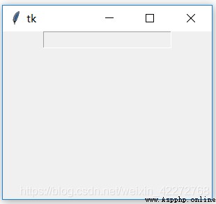
Although the background color set in the code is yellow , But because the state of the input control is DISABLED, Then the effective background color is the blue color we specified . If you do not specify the background color when the input control fails , What's going to happen ? The default background color at the time of failure will be used , It's gray .
6.1.6 disabledforeground
Set when the input control fails , The foreground in the input box ( written words ) Color .
import tkinter as tk
root=tk.Tk()
root.geometry('300x240')
txt = tk.StringVar()
b1=tk.Entry(root,textvariable=txt,width=20,
state=tk.DISABLED,disabledforeground='red')
txt.set(' Unable to input ')
b1.pack()
root.mainloop()
result :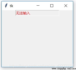
6.1.7 exportselection
Is a Boolean value , But it has no effect on the input control .
6.1.8 foreground(fg)
Set the text color of the input control . The default is black .fg and foreground It means the same , It's an abbreviation .
import tkinter as tk
root=tk.Tk()
root.geometry('300x240')
b1=tk.Entry(root,width=20,fg='red')
b1.pack()
root.mainloop()
result :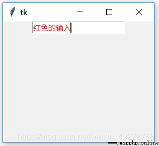
6.1.9 font
Set the font of the input text . Specific font setting methods , Please see the 3.3.3 Relevant instructions in , No more details here .
6.1.10 highlightbackground,highlightcolor and highlightthickness
These three parameters are used to set the outer border of the input control .highlightbackground Is the background color of the border when the input control does not get input focus .highlightcolor Is the background color of the border when the input control gets input focus .highlightthickness Defines the width of the border .
import tkinter as tk
root=tk.Tk()
root.geometry('300x240')
b1=tk.Entry(root,width=20,highlightbackground='red',
highlightcolor='yellow',highlightthickness=20)
b1.pack()
b2=tk.Button(root,text='Quit')
b2.pack()
root.mainloop()
result :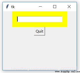
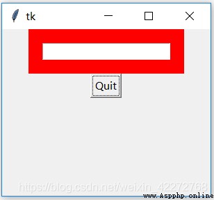
Be careful : The color change of the border is determined by whether the input control has input focus . If the input focus is still in the input box , The color of the border is still highlighted . such as , In the example above , Simply clicking the button will not make the input box lose the input focus , The color of the border will not change . If you use Tab key , Let input focus to button , At this time, the border of the input control will be set highlightbackground value .
6.1.11 insertbackground
Set the color of the cursor in the input box .
import tkinter as tk
root=tk.Tk()
root.geometry('300x240')
b1=tk.Entry(root,width=20,insertbackground='red')
b1.pack()
root.mainloop()
result :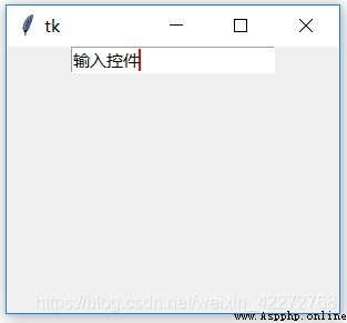
6.1.12 insertborderwidth
Set the border width of the cursor in the input box .0 There is no border ,1 To other positive integers is a border with only one pixel , Negative numbers will follow the set value , Display the border of the cursor correctly .
import tkinter as tk
root=tk.Tk()
root.geometry('300x240')
b1=tk.Entry(root,width=20,
insertbackground='red',
insertborderwidth=-50)
b1.pack()
root.mainloop()
result :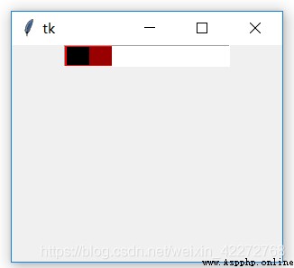
6.1.13 insertofftime and insertontime
These two parameters set the time when the cursor flashes .insertofftime Is the time when the cursor is not displayed ,insertontime Is the time displayed by the cursor . In this way, the cursor flickering effect can be realized .
import tkinter as tk
root=tk.Tk()
root.geometry('300x240')
b1=tk.Entry(root,width=20,insertofftime=2000,insertontime=5000,
insertbackground='red',insertborderwidth=-50)
b1.pack()
root.mainloop()
6.1.14 insertwidth
Set the width of the insertion cursor .
import tkinter as tk
root=tk.Tk()
root.geometry('300x240')
b1=tk.Entry(root,width=20,insertwidth=50)
b1.pack()
root.mainloop()
result :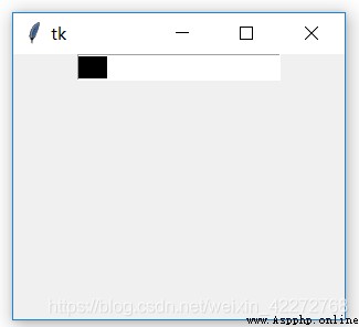
6.1.15 invalidcommand(invcmd)
see 6.1.26 Explanation
6.1.16 justify
Set the alignment of the text in the input box . Values are LEFT, CENTER, RIGHT Three .
import tkinter as tk
root=tk.Tk()
root.geometry('300x240')
b1=tk.Entry(root,width=20,justify=tk.CENTER)
b1.pack()
root.mainloop()
result :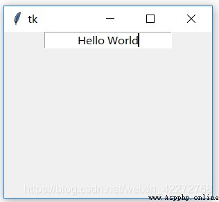
This is an example of a centered display . Other LEFT and RIGHT, You can modify the code to run verification by yourself .
6.1.17 readonlybackground
When the input control is in read-only mode , Can pass readonlybackground Set the background value .
import tkinter as tk
root=tk.Tk()
root.geometry('300x240')
txt = tk.StringVar()
b1=tk.Entry(root,width=20,textvariable=txt,
readonlybackground='yellow',state="readonly")
txt.set(' read only mode ')
b1.pack()
root.mainloop()
result :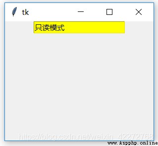
6.1.18 relief
Set the border of the input control 3D effect , The value range is :flat、groove、raised、ridge、solid and sunken. See for a detailed description 3.3.5 section .
6.1.19 selectbackground
The background color after the selected text . The default is black .
import tkinter as tk
root=tk.Tk()
root.geometry('300x240')
b1=tk.Entry(root,width=20,selectbackground='red')
b1.pack()
root.mainloop()
result :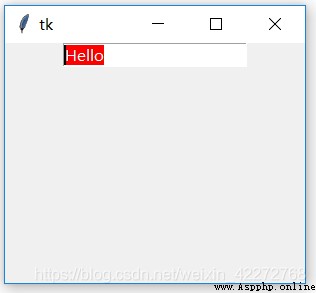
6.1.20 selectborderwidth
The border width of the selected area .
import tkinter as tk
root=tk.Tk()
root.geometry('300x240')
b1=tk.Entry(root,width=30,selectborderwidth=10)
b1.pack()
root.mainloop()
result :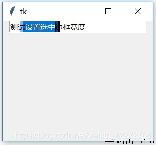
6.1.21 selectforeground
The foreground of the selected area ( Text ) The color of the . Generally, the default value is used , You can also specify . Best and selectbackground It's the opposite color . It is better to modify both parameters at the same time .
import tkinter as tk
root=tk.Tk()
root.geometry('300x240')
b1=tk.Entry(root,width=30,selectforeground='red')
b1.pack()
root.mainloop()
result :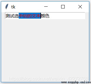
6.1.22 show
Set the alternative value of the input . The most typical use is when entering a password , use ’*’ To replace the actual input characters so as to achieve the effect of confidentiality . Actually , You can also set other characters , such as ’x’ To replace the input characters .
import tkinter as tk
root=tk.Tk()
root.geometry('300x240')
b1=tk.Entry(root,width=30,show='x')
b1.pack()
root.mainloop()
result :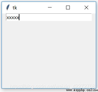
6.1.23 state
There are three states of input control :normal,disabled and readonly.normal State, , All functions of the input control can be used normally . stay disabled State, , Only realistic text , Other functions cannot be used . And in the readonly Under the state of , You just can't input or modify the contents of the input control , But you can use the selection function .
But if you set textvariable attribute , In any state , Can be changed textvariable Corresponding variable , To modify the contents of the input control .
import tkinter as tk
root=tk.Tk()
root.geometry('300x240')
txt=tk.StringVar()
b1=tk.Entry(root,textvariable=txt,width=30,state='disabled')
b1.pack()
def set_entry():
txt.set('change')
b2=tk.Button(root,text='Entry',command=set_entry)
b2.pack()
root.mainloop()
result :
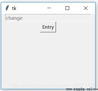
Set up state=’readonly’ You can select the contents in the input box . however disabled State, , You can't do that. . This is a readonly And disabled The difference between .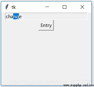
6.1.24 takefocus
Set whether the input control can pass through Tab Get input focus . Is a Boolean property . For more information, see the previous section .
6.1.25 textvariable
Set correlation tkinter The variable of , Used to modify or obtain the data of the input control . In general use StringVar(). You can also use IntVar, DoubleVar, BooleanVar etc. . The previous introduction is to use set() To set the value of the associated variable , This example uses get() To get the value of the associated variable .
import tkinter as tk
root=tk.Tk()
root.geometry('300x240')
txt=tk.StringVar()
txt2=tk.StringVar()
b1=tk.Entry(root,textvariable=txt,width=20)
b1.pack()
b2=tk.Entry(root,textvariable=txt2,width=20)
b2.pack()
def set_entry():
txt2.set(txt.get())
b3=tk.Button(root,text='Entry',command=set_entry)
b3.pack()
root.mainloop()
result :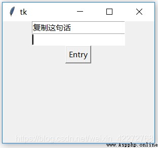
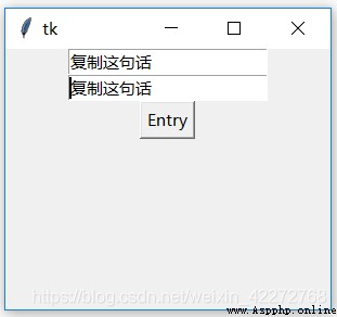
6.1.26 validate,invalidcommand and validatecommand
vaidate Defines the conditions under which input validation is triggered :
focus: When you gain or lose input focus
focuin: Only when you get input focus
focusout: When you lose input focus
key: When the contents of the input box change
ALL: All of the above
validatecommand Is the input validation function . When the input content meets the conditions , For example, all the required inputs are 0-9 The number of , It will return True, Otherwise return to False. and invalidatecommand Coincide with validatecommand contrary , Return if the requirements are not met False, Meet the requirements and return to True.
validatecommand and invalidatecommand Can define the callback function . This callback function can pass in parameters . In the setting validatecommand and invalidatecommand The explicit description of . The specific parameter transfer meanings are as follows :
If... Is set at the same time validatecommand and invalidatecommand, Execute that option first ? The first thing to execute is validatecommand. If the return value is True, Not execute invalidatecommand Defined callback function . If it is False, Would call invalidatecommand Defined callback function . But here's the thing , If the verification trigger condition is key perhaps all, Can't be used at the same time validatecommand and invalidatecommand, Otherwise, you will not be able to enter anything .
invalidatecommand Can't be used alone . There has to be validatecommand,invalidatecommand It works . Only invalidatecommand Input validation cannot be completed , Because there is no trigger at all .
The following example is to check whether the input is numeric , Otherwise, it is not allowed to enter .
import tkinter as tk
root=tk.Tk()
root.geometry('300x240')
def check_digit(content):
if content.isdigit() or content == "":
return True
else:
return False
entry_validate=root.register(check_digit)
b1 = tk.Entry(root,width=20,validate='key',vcmd=(entry_validate,'%P'))
b1.pack()
root.mainloop()
In fact, the above example requires that the input must be an integer , What if you want to enter a floating point number ? Replace isdigit() function , Use the custom check function . such as :
def int_float(value):
try:
x=int(value)
except ValueError:
try:
y = float(value)
except ValueError:
return False
else:
return True
else:
return True
This function can detect whether the input string is an integer or a floating-point number . But only positive numbers can be detected , Negative numbers cannot be detected . We can also modify and improve it , Is to first judge whether the first character input is “-”, If it is , Just use the characters after the copy to detect . Just in int_float At the beginning of the function, add the function to check whether the input string is equal to ’-’ that will do :
 if value=='-':
return True
Another possible problem is that the input field cannot be cleared , At least one number must be retained . This is because the callback function does not handle the case that the content of the input field is empty . If you delete all the characters , The value passed into the callback function is ’’, In this case, the judgment function returns False, Because none of the conditions are met . Therefore, it is necessary to add the case that the input box is empty :
if value=='':
return True
As for more complex tests , You need to write the corresponding detection function .
6.1.27 width
This property sets the width of the input control . The unit is the character . The previous example already uses this property , No more details here .
6.1.28 xscrollcommand
If you enter a lot of long characters , It exceeds the width defined by the input control , In addition to using arrows to move the cursor to browse , You can also use the scroll bar to scroll through the contents of the input box . Scroll bars will be introduced later , I won't introduce it in detail here .
import tkinter as tk
root=tk.Tk()
root.geometry('300x240')
f=tk.Frame(root)
s1 = tk.Scrollbar(f,orient=tk.HORIZONTAL)
b1 = tk.Entry(f,width=20,xscrollcommand=s1.set)
b1.pack()
s1.pack(side=tk.BOTTOM,fill=tk.X)
s1.config(command=b1.xview)
f.pack()
root.mainloop()
result :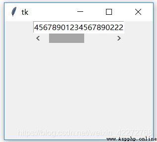
explain :
Use Frame As a container , Put the input control and scroll bar in it , In this way, the scroll bar can be set in Frame The bottom of , Just below the input control . Pay attention to use fill=tk.X, It means that X In the direction of , Scroll bar and Frame Same width . Because the widest is the input control , In this way, the scroll bar is the same width as the input control .