python tkinter Button Button Use
Create and set up windows
Button Button attribute 1
Button Button attribute 2
modify Button attribute
python tkinter Of Button Components
Tkinter There are three ways to lay out
python tkinter Button Button Use Create and set up windowsfrom tkinter import *# Create window objects root = Tk()# Window property settings root.title (' Window title ')root.geometry('300x400')root.configure(bg='blue')root.iconbitmap(r'C:\Users\Administrator\Desktop\iVista 2 OS X Icons ico\ico\Burn.ico')Mark: With windows iconbitmap Function changes the icon .
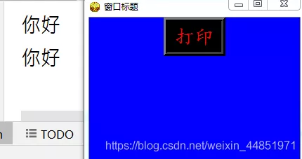
Button Button attribute 1def print1(): print(' Hello ')button = Button(root,text=' Print ', font=(' Regular script ',20),fg='red',bg='black', anchor='center',command=print1, #command It means command height=1,width=5,bd=6)button.pack()root.mainloop()Effect diagram

Mark:Button Many properties of buttons and Label Similar labels .
For example, the text (text)、 Text Fonts (font)、 font size 、 Color (fg)、 The text is in Button Position in the button (anchor)、 Alignment of different lines of text (justify)、 The height and width of the button (height、width)、 The background color of the button (bg) wait . and Lable The label compares ,Button The button has a callback function ,command= Function name , When the button is clicked , Will execute the code block of the callback function .
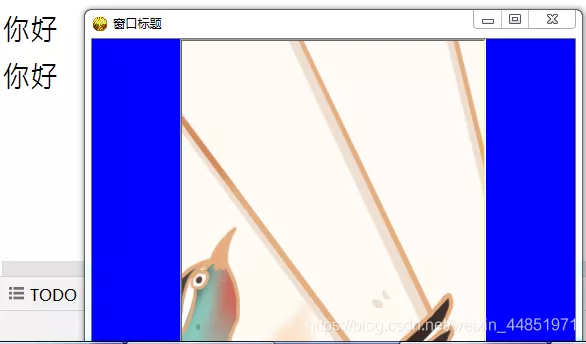
Button Button attribute 2def hello(): print(' Hello ')im = PhotoImage(file=r'C:\Users\Administrator\Desktop\ picture PNG Format \ Magpie peach blossom folding fan .png')button = Button(root,text='button',command = hello, height=500,width=500,image=im, relief= SUNKEN)button.pack()root.mainloop()Effect diagram

Mark: It can also be in Button A picture is displayed on the button .
First convert the picture you want to display into image object (PhotoImage(file=‘ Picture path ’)), And then use image attribute ,image=image object . If you do not set the height and width of the button (height,width), Then the size of the display button is the size of the image . If you set the height and width of the button , Only a part of the picture will be displayed . here ,height、width The unit of is the pixel unit .
modify Button attributeDynamic modification button Button Properties of
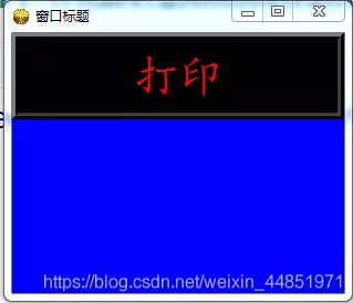
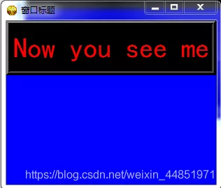
def print1(): #button['text']='Now you see me' button.configure(text='Now you see me')button = Button(root,text=' Print ', font=(' Regular script ',30),fg='red',bg='black', anchor='center',command=print1, height=1,width=20,bd=6)button.pack()root.mainloop()Effect diagram

Click on Button After button , The text content becomes

Mark:Button Properties can be modified .
If the effect you want to render is already set Button After clicking the button, the attribute changes , It can be modified in the callback function Button Properties of :Button object [‘ The key parameters ’]= The value to modify or Button object .comfigure( The key parameters = Value to modify ).
Summary : adopt Button object , We can set buttons with different appearance in the window . and , Click on Button Button , You can execute code blocks in functions .
python tkinter Of Button ComponentsThis place is not very difficult , Just remember the parameters .
Tkinter There are three ways to lay out Geometric methods describe pack() packing ;grid() grid ;place() Location ;The code is as follows :
# coding:utf8import tkinter as tkclass APP: def __init__(self, master): frame = tk.Frame(master) frame.pack(side=tk.RIGHT, padx=70, pady=100) b4 = tk.Button(frame, text=" test command Click to call the function ", bd="4", bg="yellow", command=lambda: self.Newtk("x")) b4.pack() @staticmethod def Newtk(x): if x != "x": return 0 win1 = tk.Tk() win1.title(" Prompt information ") frame1 = tk.Frame(win1) frame1.pack(side=tk.RIGHT, padx=70, pady=100) l1 = tk.Label(frame1, text=" Oh , You click on the . Play a box for you ") l1.pack()admin = tk.Tk()admin.title(" test Button")win = APP(admin)admin.mainloop()w = Button ( master, option=value, ... ) Sn optional & describe 1activebackground
When the mouse is up , The background color of the button
2activeforeground
When the mouse is up , The foreground color of the button
3bd
The size of the button border , The default is 2 Pixel
4bg
The background color of the button
5command
The function associated with the button , When the button is clicked , Execute this function
6fg
The foreground color of the button ( The color of the button text )
7font
Text Fonts
8height
The height of the button
9highlightcolor
The color to highlight
10image
The picture to be displayed on the button
11justify
When displaying multiple lines of text , Set the alignment between different rows , Options include LEFT, RIGHT, CENTER
12padx
Button x The inner margin in the axis direction (padding), It refers to the distance between the button content and the button edge
13pady
Button y The inner margin in the axis direction (padding)
14relief
Border style , Setting controls 3D effect , Optional :FLAT、SUNKEN、RAISED、GROOVE、RIDGE. The default is FLAT.
15state
Set button component status , Optional NORMAL、ACTIVE、 DISABLED. Default NORMAL.
16underline
Underline . The text on the default button is not underlined . The value is the underlined string index , by 0 when , The first character is underlined , by 1 when , The first two characters are underlined , And so on
17width
The width of the button , If this item is not set , Its size to fit the contents of the button ( Size of text or picture )
18wraplength
Limit the number of characters displayed on each line of the button
19text
The text content of the button
19anchor
Anchor options , Controls the position of the text , The default is center
The above is personal experience , I hope I can give you a reference , I also hope you can support the software development network .