This article will use PYTHON drawing In bitcoin (BTC) For example Drawing analysis ( Xiaobaixiang )
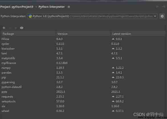
Pycharm Platform compilation
import requests
from lxml import etree
import math
import pandas as pd
import numpy as np
import matplotlib.pyplot as plt
from mplfinance.original_flavor import candlestick_ohlc
from matplotlib.pylab import date2num
import datetime
Data from abroad coinmarketcap( You need to go online scientifically ) To extract 2021.2.1-2022.2.3 The data of
coinmarketcap
https://coinmarketcap.com/currencies/bitcoin/historical-data/?start=20210101&end=20220202)
I put the data directly into the network disk , How can you climb behind me and mend it ( But it's no use being an overachiever. You don't have to know anything about it )
link :https://pan.baidu.com/s/1C3np-mnd-AAX_4u3XlnZ_A
Extraction code :7bxn
Crawling is HTML Format , The following code is transformed
The data includes 7 Elements
‘date’: date
‘open’: Opening price
‘high’: The highest price of the day
‘low’: The lowest price of the day
‘close’: Closing price
‘volume’: Total trading volume of the day
‘Market Cap’: Market value of the day 
with open("data.txt", "r") as f: rd = f.read()
selector = etree.HTML(rd)
url_infos = selector.xpath('//tr')
data = []
for url_info in url_infos:
l = []
for i in range(7):
d = url_info.xpath('td[%d+1]/text()' % i)
if i == 0:
l += d
else:
if d[0] == '-':
d[0] = np.nan
l += d
else:
d[0] = d[0].replace(',', '')
d[0] = d[0].strip('$')
d[0] = float(d[0])
l += d
data.append(l)
arr = np.array(data)
df = pd.DataFrame(arr)
df.columns = ['date', 'open', 'high', 'low', 'close', 'volume', 'Market Cap']
df = df.astype({
'open': 'float64', 'high': 'float64', 'low': 'float64', 'close': 'float64', 'volume': 'float64', 'Market Cap': 'float64'})
df = df.reindex(index=df.index[::-1])
df.head() # In reverse order
df.reset_index(drop=True, inplace=True) # After reverse order reset index
df.reset_index(inplace=True) # reset index, The original index Remittance DataFrame in
df['date']=pd.to_datetime(df['date'])
df = df.astype({
'date': 'string'})
df.index = pd.to_datetime(df['date']) # Set up index Value
print(df)
print(df.dtypes)
df['date'] = df['date'].apply(lambda x: date2num(datetime.datetime.strptime(x, '%Y-%m-%d')))# Convert date format
print(df.dtypes)
print(df)
The output is as follows 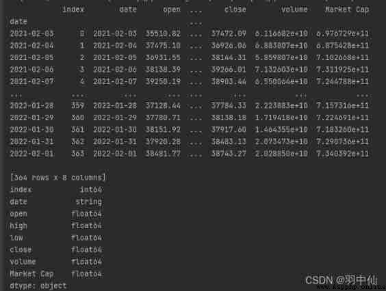
First on the renderings , Attached is the code that can be run directly ( The data is from the network disk data.txt)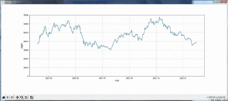
Code
from lxml import etree
import pandas as pd
import numpy as np
import matplotlib.pyplot as plt
from mplfinance.original_flavor import candlestick_ohlc
from matplotlib.pylab import date2num
import datetime
with open("data.txt", "r") as f: rd = f.read()
selector = etree.HTML(rd)
url_infos = selector.xpath('//tr')
# from data.txt Extract the required data from
data = []
for url_info in url_infos:
l = []
# Obtain single line data and perform preliminary processing
for i in range(7):
d = url_info.xpath('td[%d+1]/text()' % i)
if i == 0:
l += d
else:
if d[0] == '-':
d[0] = np.nan
l += d
else:
d[0] = d[0].replace(',', '')
d[0] = d[0].strip('$')
d[0] = float(d[0])
l += d
data.append(l)
arr = np.array(data)
df = pd.DataFrame(arr) # Convert data to DataFrame data type
df.columns = ['date', 'open', 'high', 'low', 'close', 'volume', 'Market Cap'] # Set column title
# df['date']=df['date'].map(pd.to_datetime)# Convert date format
df = df.astype({
'open': 'float64', 'high': 'float64', 'low': 'float64', 'close': 'float64', 'volume': 'float64', 'Market Cap': 'float64'})
df = df.reindex(index=df.index[::-1])
df.head() # In reverse order
df.reset_index(drop=True, inplace=True) # After reverse order reset index
plt.rcParams['axes.unicode_minus'] = False# Solve the confusion of negative sign of coordinate axis scale
plt.rcParams['font.sans-serif'] = ['Simhei']# Solve the problem of Chinese garbled code
df.reset_index(inplace=True) # reset index, The original index Remittance DataFrame in
df['date']=pd.to_datetime(df['date'])
df = df.astype({
'date': 'string'})
df.index = pd.to_datetime(df['date']) # Set up index Value
print(df)
print(df.dtypes)
df['date'] = df['date'].apply(lambda x: date2num(datetime.datetime.strptime(x, '%Y-%m-%d')))# Convert date format
print(df.dtypes)
print(df)
fig, ax2 = plt.subplots(figsize=(1200 / 72, 480 / 72))
ax2.plot(df['date'], df['close'])
ax2.grid(True)
ax2.set_ylim(0, 70000)
fig.subplots_adjust(bottom=0.2) ## Adjust the bottom distance
ax2.xaxis_date() ## Set up X The axis scale is date time
plt.yticks() ## Set up Y Axis scale mark
plt.xlabel(u" Time ") ## Set up X Axis title
ax2.set_ylabel(' Closing price ')
plt.grid(True, 'major', 'both', ls='--', lw=.5, c='k', alpha=.3) ## Set gridlines
plt.show()
Here it is directly superimposed with the price chart to display 
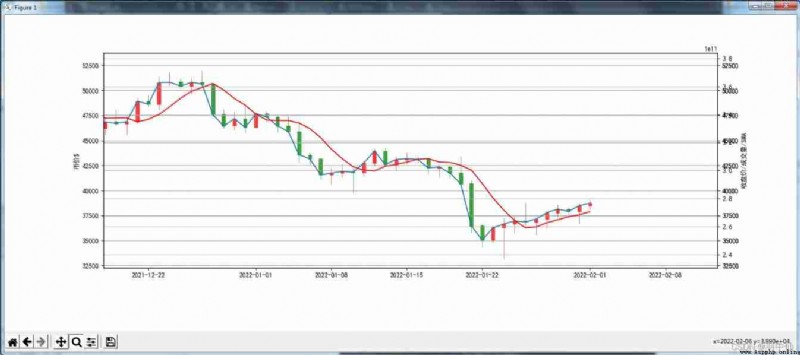
After zooming in, it looks like this :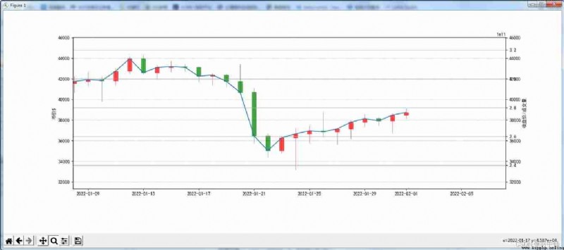
from lxml import etree
import pandas as pd
import numpy as np
import matplotlib.pyplot as plt
from mplfinance.original_flavor import candlestick_ohlc
from matplotlib.pylab import date2num
import datetime
with open("data.txt", "r") as f: rd = f.read()
selector = etree.HTML(rd)
url_infos = selector.xpath('//tr')
# from data.txt Extract the required data from
data = []
for url_info in url_infos:
l = []
# Obtain single line data and perform preliminary processing
for i in range(7):
d = url_info.xpath('td[%d+1]/text()' % i)
if i == 0:
l += d
else:
if d[0] == '-':
d[0] = np.nan
l += d
else:
d[0] = d[0].replace(',', '')
d[0] = d[0].strip('$')
d[0] = float(d[0])
l += d
data.append(l)
arr = np.array(data)
df = pd.DataFrame(arr) # Convert data to DataFrame data type
df.columns = ['date', 'open', 'high', 'low', 'close', 'volume', 'Market Cap'] # Set column title
# df['date']=df['date'].map(pd.to_datetime)# Convert date format
df = df.astype({
'open': 'float64', 'high': 'float64', 'low': 'float64', 'close': 'float64', 'volume': 'float64', 'Market Cap': 'float64'})
df = df.reindex(index=df.index[::-1])
df.head() # In reverse order
df.reset_index(drop=True, inplace=True) # After reverse order reset index
plt.rcParams['axes.unicode_minus'] = False# Solve the confusion of negative sign of coordinate axis scale
plt.rcParams['font.sans-serif'] = ['Simhei']# Solve the problem of Chinese garbled code
df.reset_index(inplace=True) # reset index, The original index Remittance DataFrame in
df['date']=pd.to_datetime(df['date'])
df = df.astype({
'date': 'string'})
df.index = pd.to_datetime(df['date']) # Set up index Value
print(df)
print(df.dtypes)
df['date'] = df['date'].apply(lambda x: date2num(datetime.datetime.strptime(x, '%Y-%m-%d')))# Convert date format
print(df.dtypes)
print(df)
fig, ax1 = plt.subplots(figsize=(1200 / 72, 480 / 72))
da = df[['date', 'open', 'high', 'low', 'close']]
f = da[['date', 'open', 'high', 'low', 'close']].values
ax3 = ax1.twinx()
ax2 = ax1.twinx()
candlestick_ohlc(ax1, f, colordown='g', colorup='r', width=0.3, alpha=0.7)
ax3.bar(df['date'], df['volume'], width=0.6)
ax2.plot(df['date'], df['close'])
ax2.grid(True)
ax3.grid(True)
ax3.set_ylim(0, 500000000000)
ax1.set_ylim(0, 70000)
ax2.set_ylim(0, 70000)
ax1.set_ylabel(' The price of money $')
fig.subplots_adjust(bottom=0.2) ## Adjust the bottom distance
ax1.xaxis_date() ## Set up X The axis scale is date time
ax2.xaxis_date() ## Set up X The axis scale is date time
ax3.xaxis_date() ## Set up X The axis scale is date time
plt.yticks() ## Set up Y Axis scale mark
plt.xlabel(u" Time ") ## Set up X Axis title
ax2.set_ylabel(' Closing price / volume ')
plt.grid(True, 'major', 'both', ls='--', lw=.5, c='k', alpha=.3) ## Set gridlines
plt.show()
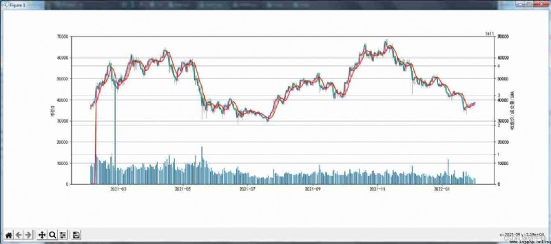
Here is a basic indicator : Simple moving average SMA( It is used to check the average price )
For details, please refer to this article :
https://zhuanlan.zhihu.com/p/422205612
For example :
Altogether 10 The closing price for consecutive days :1 2 3 4 5 6 7 8 9 10
I need a word 3SMA Line ( Namely 3 A simple moving average of three cycles )
Then I will get a group after 7 Day closing price 3SMA
(1+2+3)/3,(2+3+4)/3,…,(8+9+10)/3
Now I draw a 5SMA Graph ( The red line )
Calculation 5SMA Code for
step=5
dflen=len(df)
sma= {
}
for i in range(step):
sma[i]=0
for i in range(dflen-step):
i+=step
sma[i]=0
for j in range(step):
j+=1
sma[i] += df['close'][i-j]
if j==step: sma[i]=sma[i]/step
sma = pd.DataFrame.from_dict(sma,orient='index',columns=['SMA'])
print(sma)
Output the complete code of the picture
from lxml import etree
import pandas as pd
import numpy as np
import matplotlib.pyplot as plt
from mplfinance.original_flavor import candlestick_ohlc
from matplotlib.pylab import date2num
import datetime
with open("data.txt", "r") as f: rd = f.read()
selector = etree.HTML(rd)
url_infos = selector.xpath('//tr')
# from data.txt Extract the required data from
data = []
for url_info in url_infos:
l = []
# Obtain single line data and perform preliminary processing
for i in range(7):
d = url_info.xpath('td[%d+1]/text()' % i)
if i == 0:
l += d
else:
if d[0] == '-':
d[0] = np.nan
l += d
else:
d[0] = d[0].replace(',', '')
d[0] = d[0].strip('$')
d[0] = float(d[0])
l += d
data.append(l)
arr = np.array(data)
df = pd.DataFrame(arr) # Convert data to DataFrame data type
df.columns = ['date', 'open', 'high', 'low', 'close', 'volume', 'Market Cap'] # Set column title
# df['date']=df['date'].map(pd.to_datetime)# Convert date format
df = df.astype({
'open': 'float64', 'high': 'float64', 'low': 'float64', 'close': 'float64', 'volume': 'float64', 'Market Cap': 'float64'})
df = df.reindex(index=df.index[::-1])
df.head() # In reverse order
df.reset_index(drop=True, inplace=True) # After reverse order reset index
plt.rcParams['axes.unicode_minus'] = False# Solve the confusion of negative sign of coordinate axis scale
plt.rcParams['font.sans-serif'] = ['Simhei']# Solve the problem of Chinese garbled code
df.reset_index(inplace=True) # reset index, The original index Remittance DataFrame in
df['date']=pd.to_datetime(df['date'])
df = df.astype({
'date': 'string'})
df.index = pd.to_datetime(df['date']) # Set up index Value
print(df)
print(df.dtypes)
df['date'] = df['date'].apply(lambda x: date2num(datetime.datetime.strptime(x, '%Y-%m-%d')))# Convert date format
print(df.dtypes)
print(df)
step=5
dflen=len(df)
sma= {
}
for i in range(step):
sma[i]=0
for i in range(dflen-step):
i+=step
sma[i]=0
for j in range(step):
j+=1
sma[i] += df['close'][i-j]
if j==step: sma[i]=sma[i]/step
sma = pd.DataFrame.from_dict(sma,orient='index',columns=['SMA'])
print(sma)
fig, ax1 = plt.subplots(figsize=(1200 / 72, 480 / 72))
da = df[['date', 'open', 'high', 'low', 'close']]
f = da[['date', 'open', 'high', 'low', 'close']].values
ax3 = ax1.twinx()
ax2 = ax1.twinx()
axsma=ax1.twinx()
candlestick_ohlc(ax1, f, colordown='g', colorup='r', width=0.3, alpha=0.7)
ax3.bar(df['date'], df['volume'], width=0.6)
ax2.plot(df['date'], df['close'])
axsma.plot(df['date'],sma['SMA'],color="r")
ax2.grid(True)
ax3.grid(True)
axsma.grid(True)
ax3.set_ylim(0, 500000000000)
ax1.set_ylim(0, 70000)
ax2.set_ylim(0, 70000)
axsma.set_ylim(0, 70000)
ax1.set_ylabel(' The price of money $')
fig.subplots_adjust(bottom=0.2) ## Adjust the bottom distance
ax1.xaxis_date() ## Set up X The axis scale is date time
ax2.xaxis_date() ## Set up X The axis scale is date time
ax3.xaxis_date() ## Set up X The axis scale is date time
axsma.xaxis_date() ## Set up X The axis scale is date time
plt.yticks() ## Set up Y Axis scale mark
plt.xlabel(u" Time ") ## Set up X Axis title
ax2.set_ylabel(' Closing price / volume /SMA')
plt.grid(True, 'major', 'both', ls='--', lw=.5, c='k', alpha=.3) ## Set gridlines
plt.show()
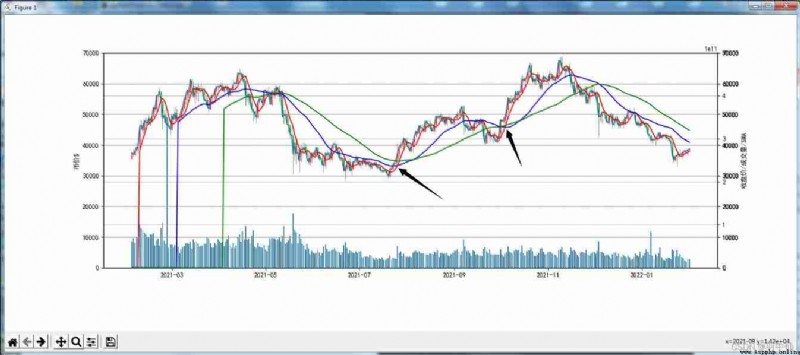
Next, put 5SMA( Red ) 、30SMA( yellow )、 60SMA( green ) Reflect on a picture
2 The black arrow at the right shows A golden fork phenomenon often said in the stock market ( But I am a SMA Of ) The short term 5SMA With the long line 60SMA Cross the bottom up , Usually this is a buying signal ( At that time, it was a double offer , The actual combat can only be used as a reference point for judging the trend )
Finally, analyze this 2 month 3 In the future BTC Possible trends
You can see... In the picture The closing price line is in the middle 、 Below the long-term average , There will be a general trend of moving towards the average price , The buying opportunity should be 60SMA On 5SMA Progressive , Maybe a week or two There will be a cross trend
You should understand the role of indicators here The prediction is actually just to provide some data for you to judge , Indicators vary , Various stocks The monetary software needs the lines of various indicators Like MA EMA BOLL SAR Of Welcome to discuss and analyze , This article is also a little white Introduction , Let you understand The way data is transformed into pictures K Understanding of line diagram
Q149021708
from lxml import etree
import pandas as pd
import numpy as np
import matplotlib.pyplot as plt
from mplfinance.original_flavor import candlestick_ohlc
from matplotlib.pylab import date2num
import datetime
with open("data.txt", "r") as f: rd = f.read()
selector = etree.HTML(rd)
url_infos = selector.xpath('//tr')
# from data.txt Extract the required data from
data = []
for url_info in url_infos:
l = []
# Obtain single line data and perform preliminary processing
for i in range(7):
d = url_info.xpath('td[%d+1]/text()' % i)
if i == 0:
l += d
else:
if d[0] == '-':
d[0] = np.nan
l += d
else:
d[0] = d[0].replace(',', '')
d[0] = d[0].strip('$')
d[0] = float(d[0])
l += d
data.append(l)
arr = np.array(data)
df = pd.DataFrame(arr) # Convert data to DataFrame data type
df.columns = ['date', 'open', 'high', 'low', 'close', 'volume', 'Market Cap'] # Set column title
# df['date']=df['date'].map(pd.to_datetime)# Convert date format
df = df.astype({
'open': 'float64', 'high': 'float64', 'low': 'float64', 'close': 'float64', 'volume': 'float64', 'Market Cap': 'float64'})
df = df.reindex(index=df.index[::-1])
df.head() # In reverse order
df.reset_index(drop=True, inplace=True) # After reverse order reset index
plt.rcParams['axes.unicode_minus'] = False# Solve the confusion of negative sign of coordinate axis scale
plt.rcParams['font.sans-serif'] = ['Simhei']# Solve the problem of Chinese garbled code
df.reset_index(inplace=True) # reset index, The original index Remittance DataFrame in
df['date']=pd.to_datetime(df['date'])
df = df.astype({
'date': 'string'})
df.index = pd.to_datetime(df['date']) # Set up index Value
print(df)
print(df.dtypes)
df['date'] = df['date'].apply(lambda x: date2num(datetime.datetime.strptime(x, '%Y-%m-%d')))# Convert date format
print(df.dtypes)
print(df)
step=5
dflen=len(df)
sma= {
}
for i in range(step):
sma[i]=0
for i in range(dflen-step):
i+=step
sma[i]=0
for j in range(step):
j+=1
sma[i] += df['close'][i-j]
if j==step: sma[i]=sma[i]/step
sma = pd.DataFrame.from_dict(sma,orient='index',columns=['5SMA'])
print(sma)
step=30
dflen=len(df)
sma30= {
}
for i in range(step):
sma30[i]=0
for i in range(dflen-step):
i+=step
sma30[i]=0
for j in range(step):
j+=1
sma30[i] += df['close'][i-j]
if j==step: sma30[i]=sma30[i]/step
sma30 = pd.DataFrame.from_dict(sma30,orient='index',columns=['30SMA'])
print(sma30)
step=60
dflen=len(df)
sma60= {
}
for i in range(step):
sma60[i]=0
for i in range(dflen-step):
i+=step
sma60[i]=0
for j in range(step):
j+=1
sma60[i] += df['close'][i-j]
if j==step: sma60[i]=sma60[i]/step
sma60 = pd.DataFrame.from_dict(sma60,orient='index',columns=['60SMA'])
print(sma60)
fig, ax1 = plt.subplots(figsize=(1200 / 72, 480 / 72))
da = df[['date', 'open', 'high', 'low', 'close']]
f = da[['date', 'open', 'high', 'low', 'close']].values
ax3 = ax1.twinx()
ax2 = ax1.twinx()
axsma=ax1.twinx()
axsma30=ax1.twinx()
axsma60=ax1.twinx()
candlestick_ohlc(ax1, f, colordown='g', colorup='r', width=0.3, alpha=0.7)
ax3.bar(df['date'], df['volume'], width=0.6)
ax2.plot(df['date'], df['close'])
axsma.plot(df['date'],sma['5SMA'],color="red")
axsma30.plot(df['date'],sma30['30SMA'],color="blue")
axsma60.plot(df['date'],sma60['60SMA'],color="green")
ax2.grid(True)
ax3.grid(True)
axsma.grid(True)
axsma30.grid(True)
axsma60.grid(True)
ax3.set_ylim(0, 500000000000)
ax1.set_ylim(0, 70000)
ax2.set_ylim(0, 70000)
axsma.set_ylim(0, 70000)
axsma30.set_ylim(0, 70000)
axsma60.set_ylim(0, 70000)
ax1.set_ylabel(' The price of money $')
fig.subplots_adjust(bottom=0.2) ## Adjust the bottom distance
ax1.xaxis_date() ## Set up X The axis scale is date time
ax2.xaxis_date() ## Set up X The axis scale is date time
ax3.xaxis_date() ## Set up X The axis scale is date time
axsma.xaxis_date() ## Set up X The axis scale is date time
plt.yticks() ## Set up Y Axis scale mark
plt.xlabel(u" Time ") ## Set up X Axis title
ax2.set_ylabel(' Closing price / volume /SMA')
plt.grid(True, 'major', 'both', ls='--', lw=.5, c='k', alpha=.3) ## Set gridlines
plt.show()
To be continued …