A long time ago seaborn There are some involved but not explored in depth , This time there is a need for data visualization , Just learn
Seaborn In fact matplotlib On the basis of a more advanced API encapsulation , So it's easier to draw , Use... In most cases seaborn Can make a very attractive picture , It provides great convenience for data analysis . But you should Seaborn As matplotlib A supplement to , It's not a substitute .
This time start with the most basic icon style and palette , Study seaborn.
# utilize matplotlib Create a sine function and graph
def sinplot(flip=1):
x = np.linspace(0, 14, 100)
# fig = plt.figure(figsize=(10,6))
for i in range(1,7):
plt.plot(x, np.sin(x + i * .5) * (7 - i) * flip)
sinplot()
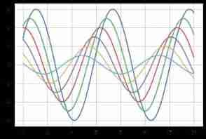
seaborn.set(context =‘notebook’,style =‘darkgrid’,palette =‘deep’,font =‘sans-serif’,font_scale = 1,color_codes = True,rc = None)
sns.set(style='darkgrid',font_scale=1.5)
# With this method, you can quickly set seaborn The default style of , Of course, you can also add parameters to set other styles
# font_scale:float, A separate scaling factor can scale the size of a font element independently .
sinplot()
seaborn.set_style(style = None,rc = None )
# Switch seaborn Chart style
# Style choices include :"white", "dark", "whitegrid", "darkgrid", "ticks"
# rc:dict, Optional , Parameter mapping to override the preset seaborn Values in the style Dictionary
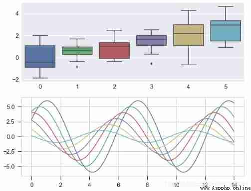
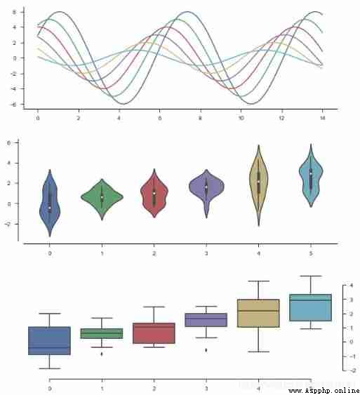
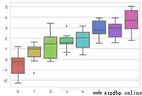
fig = plt.figure(figsize=(10, 8))
ax1 = fig.add_subplot(2, 1, 1)
sns.set_style('whitegrid',{
"xtick.major.size": 10, "ytick.major.size": 10})
data = np.random.normal(size=(20,6)) + np.arange(6) / 2
sns.boxplot(data=data)
ax2 = fig.add_subplot(2, 1, 2)
sinplot()
seaborn.despine(fig=None, ax=None, top=True, right=True, left=False, bottom=False, offset=None, trim=False)
# Set chart axis
sns.set(style='ticks',font_scale=1)
# Set style
fig = plt.figure(figsize=(10,12))
plt.subplots_adjust(hspace=0.3) # Adjust the spacing of subgraphs
# Chart basic settings
ax1 = fig.add_subplot(3, 1, 1)
sinplot()
sns.despine(ax=ax1)
# The right and upper axes are hidden by default
ax2 = fig.add_subplot(3, 1, 2)
sns.violinplot(data=data)
sns.despine(ax=ax2,offset={
'bottom':5,'left':10})
# offset : Whether the coordinate axes are offset separately , Positive values move outward , Negative values move inward . The dictionary can be used to set... For each axis individually
# trim: When it comes to True when , Both ends of the coordinate axis are limited to the maximum and minimum values of the data
ax3 = fig.add_subplot(3, 1, 3)
sns.boxplot(data=data, palette='deep')
sns.despine(ax=ax3,left=True, right= False, trim=True,
offset={
'bottom':10,'right':10})
# top, right, left, bottom: Boolean type , by True Time does not show
# 4、axes_style()
# Set local chart style , Can learn and with Use of coordination
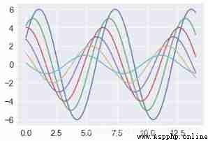
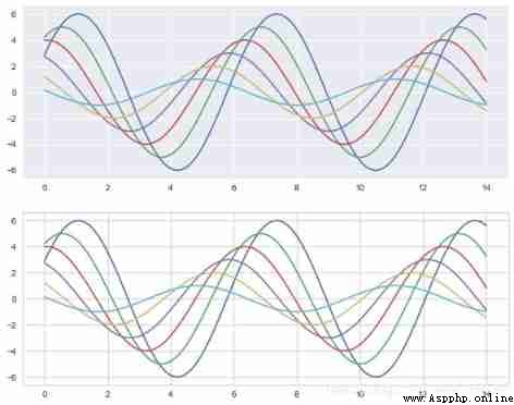
fig = plt.figure(figsize=(10,8))
with sns.axes_style("darkgrid"):
plt.subplot(211)
sinplot()
# Set local chart style , use with Make code block distinction
sns.set_style("whitegrid")
plt.subplot(212)
sinplot()
# External table style
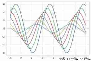
seaborn.set_context(context = None,font_scale = 1,rc = None )
# Set the display scale
# Options include :'paper', 'notebook', 'talk', 'poster'. These four are preset . Does not affect the overall style .
# The default is notebook
sns.set_context("notebook")
sinplot()
plt.grid(linestyle='--')
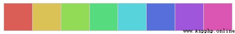
sns.color_palette(palette=None, n_colors=None, desat=None)
We often choose colors according to data characteristics , So let's start with
classification : They differ greatly from each other continuity : Color gradients in order Divergence : Light in the middle , Both ends are dark Three palettes to explain color_palette() function
When you don't have to distinguish the order of discrete data , It is recommended to use the classification palette
# Default 6 Color :deep, muted, pastel, bright, dark, colorblind
# n_colors:int, Number of colors in the palette
# dasat:float, Desaturation 0-1 Between
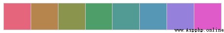
current_palette = sns.color_palette()
sns.palplot(current_palette)
# When called without parameters, all colors in the current default color loop will be returned
# You can pass in anything matplotlib Supported colors

When you need to 6 Medium or above , You can draw colors at uniform intervals in a circular color space .
The most common is the use of hls Color space .
sns.palplot(sns.color_palette('hls',8))
# The number of color patches is 8 individual
data = np.random.normal(size=(10, 8)) + np.arange(8) / 2
sns.boxplot(data=data,palette=sns.color_palette("hls", 8))
plt.show()
# Set brightness , saturation
# h - The first tone
# l - brightness
# s - saturation
sns.palplot(sns.husl_palette(8, l=.6, s=.7))
# This one looks more comfortable , It's easier to distinguish
Another category palette comes from Color Brewer( It also has a continuous palette and a divergent palette ), It also exists in matplotlib colormaps in , But it has not been well handled . stay Seaborn in , When you call Color Brewer When sorting color swatches , You can always get discrete colors , But that means they start a cycle at some point .
Color Brewer A good feature of the website is that it provides some guidance on which color palettes are color blind safe
# Color Brewer color setting
sns.palplot(sns.color_palette("Paired",8))
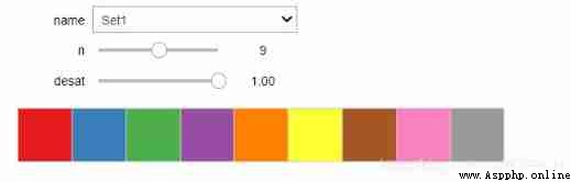
sns.palplot(sns.color_palette("Set1",10))


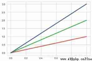
xkcd Contains a series of names RGB Color . common 954 Color , You can now use xkcd_rgb The dictionary is seaborn They are quoted in :
plt.plot([0, 1], [0, 1], sns.xkcd_rgb["pale red"], lw=3)
plt.plot([0, 1], [0, 2], sns.xkcd_rgb["medium green"], lw=3)
plt.plot([0, 1], [0, 3], sns.xkcd_rgb["denim blue"], lw=3)
When data ranges from relatively low or uninteresting values to relatively high or interesting values , Continuous... Can be used ( The order ) palette , stay kdeplot() and heatmap() Functions are often used .
Color maps with large hue shift often introduce discontinuities that do not exist in the data , And our visual system cannot naturally map rainbows to things like “ high ” or “ low ” Quantitative differences . The result is that these visualizations are ultimately more like a puzzle , They blur patterns in the data rather than reveal them
So for sequential data , It's best to use a palette with the most subtle shifts in hues , Accompanied by large changes in brightness and saturation . This approach naturally draws attention to the relatively important parts of the data
sns.palplot(sns.color_palette("Blues"))
sns.palplot(sns.color_palette("Blues_r"))
# And matplotlib In the same , If you want to reverse the brightness gradient , Then it can be _r Add a suffix to the palette name
# Not all colors can be reversed !!!


cubehelix The palette system is a linear palette that can change both brightness and hue . This means that when converted to black and white ( For printing ) Or when viewed by a color blind individual , The information in the color map will be preserved .
seaborn.cubehelix_palette(n_colors = 6,start = 0,rot = 0.4,gamma = 1.0,hue = 0.8,light = 0.85,dark = 0.15,reverse = False,as_cmap = False )
# Calculated according to linear growth , Set the color
sns.palplot(sns.color_palette("cubehelix", 8))
sns.palplot(sns.cubehelix_palette(8, gamma=2))
sns.palplot(sns.cubehelix_palette(8, start=.5, rot=-.75))
sns.palplot(sns.cubehelix_palette(8, start=2, rot=0, dark=0, light=.95, reverse=True))
# n_colors → Number of colors
# start → The value range is [0,3], Start color
# rot → float, Color rotation angle , May be (-1,1) Between
# gamma → Color gamma value ,>1 Brighter ,<1 Darker
# dark,light → Value range 0-1, The color is dark and light
# reverse → Boolean value , The default is False, From shallow to deep

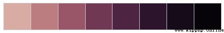


For a simple interface to customize the order palette , You can use light_palette() Or use dark_palette(), Is a single color and generates a gradient palette from light or dark desaturation values to that color . These functions are accompanied by the ability to launch interactive widgets to create these palettes
seaborn.light_palette(color,n_colors = 6,reverse = False,as_cmap = False,input =‘rgb’ )
seaborn.dark_palette(color,n_colors = 6,reverse = False,as_cmap = False,input =‘rgb’ )
# color: Hex code ,html Color name or input Tuples in space
# input: {'rgb','hls','husl',xkcd'}
# The color space used to interpret the input color . The first three options apply to tuple input , The latter applies to string input
sns.palplot(sns.light_palette("green"))# according to green Make a light palette
sns.palplot(sns.dark_palette('green', reverse=True))# according to green Make a dark palette
sns.palplot(sns.light_palette((260, 75, 60), input="husl"))
sns.palplot(sns.dark_palette("muted purple", input="xkcd"))


The third type of palette is called “ Divergence ”. These are interesting data for both high and low values . There is usually a well-defined midpoint in the data . for example , If you want to plot the temperature change at a baseline time point , It is better to use the deviation color chart to show the relatively reduced areas and the relatively increased areas .
It is also important to emphasize that the use of red and green should be avoided , Because a large number of potential viewers will not be able to distinguish them
seaborn.diverging_palette(h_neg, h_pos, s=75, l=50, sep=10, n=6,
center=‘light’, as_cmap=False)
# Create a scatter color
# h_neg, h_pos → start / End color value
# s → Value range 0-100, saturation
# l → Value range 0-100, brightness
# n → Number of colors
# center → Is the center color light or dark “light”,“dark”, The default is light
# Color Brewer The library comes with a carefully selected set of divergent color maps
sns.palplot(sns.color_palette("BrBG", 7))
# Of course, you can customize it yourself
sns.palplot(sns.diverging_palette(145, 280, s=85, l=25, n=7))


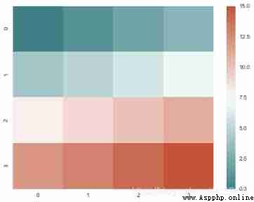
plt.figure(figsize = (8,6))
x = np.arange(16).reshape(4, 4)
cmap = sns.diverging_palette(200, 20, sep=16, as_cmap=True)
sns.heatmap(x, cmap=cmap)
You can use the choose_colorbrewer_palette() Function to play various color options , If you want the return value to be passed to seaborn or matplotlib Functional colormap object , Then you can put as_cmap Parameter set to True
seaborn.choose_colorbrewer_palette(data_type, as_cmap=False)
sns.choose_colorbrewer_palette('q')
# sequential: The order , It can be used s Instead of
# diverging: Divergence , It can be used d Instead of
# qualitative: classification , It can be used q Instead of
# Color Brewer Color map of :
# Accent, Accent_r, Blues, Blues_r, BrBG, BrBG_r, BuGn, BuGn_r, BuPu,
# BuPu_r, CMRmap, CMRmap_r, Dark2, Dark2_r, GnBu, GnBu_r, Greens, Greens_r, Greys,
#Greys_r, OrRd, OrRd_r, Oranges, Oranges_r, PRGn, PRGn_r,
# Paired, Paired_r, Pastel1, Pastel1_r, Pastel2, Pastel2_r, PiYG, PiYG_r, PuBu, PuBuGn,
#PuBuGn_r, PuBu_r, PuOr, PuOr_r, PuRd, PuRd_r, Purples,
# Purples_r, RdBu, RdBu_r, RdGy, RdGy_r, RdPu, RdPu_r, RdYlBu, RdYlBu_r, RdYlGn, RdYlGn_r,
# Reds, Reds_r, Set1, Set1_r, Set2, Set2_r, Set3,
# Set3_r, Spectral, Spectral_r, Wistia, Wistia_r, YlGn, YlGnBu, YlGnBu_r, YlGn_r, YlOrBr,
# YlOrBr_r, YlOrRd, YlOrRd_r, afmhot, afmhot_r,
# autumn, autumn_r, binary, binary_r, bone, bone_r, brg, brg_r, bwr, bwr_r, cool, cool_r,
# coolwarm, coolwarm_r, copper, copper_r, cubehelix,
# cubehelix_r, flag, flag_r, gist_earth, gist_earth_r, gist_gray, gist_gray_r, gist_heat,
# gist_heat_r, gist_ncar, gist_ncar_r, gist_rainbow,
# gist_rainbow_r, gist_stern, gist_stern_r, gist_yarg, gist_yarg_r, gnuplot, gnuplot2,
# gnuplot2_r, gnuplot_r, gray, gray_r, hot, hot_r, hsv,
# hsv_r, icefire, icefire_r, inferno, inferno_r, jet, jet_r, magma, magma_r, mako,
# mako_r, nipy_spectral, nipy_spectral_r, ocean, ocean_r,
# pink, pink_r, plasma, plasma_r, prism, prism_r, rainbow, rainbow_r, rocket, rocket_r,
# seismic, seismic_r, spectral, spectral_r, spring,
# spring_r, summer, summer_r, terrain, terrain_r, viridis, viridis_r, vlag, vlag_r, winter, winter_r
Be similar to color_palette().set_palette() Accept the same parameters , But it will change the default matplotlib Parameters , So that the palette Apply to all drawings .
# After setting the palette , Chartcreate charts
sns.set_style("whitegrid")
fig = plt.figure(figsize=(8,6))
# Set style
with sns.color_palette("PuBuGn_d"):
plt.subplot(211)
sinplot()
sns.set_palette("husl")
plt.subplot(212)
sinplot()
# Draw series colors

 Python will tell you in two minutes how to brutally crack the WiFi password of Lao Wang next door
Preface : It is said that “ Ho
 Python crawler engineers here, do you dare to crawl the site of a law firm?
Table of Contents ️ 實戰場景&