python Data visualization seaborn( 3、 ... and )—— Explore the relationship between variables
We often wonder if there is a correlation between variables , And whether these associations are affected by other variables . Visualization can help us visualize these .
import numpy as np
import pandas as pd
import matplotlib.pyplot as plt
import seaborn as sns
%matplotlib inline
import warnings
warnings.filterwarnings('ignore')
# No warning
sns.set_context('notebook',font_scale=1.2)
tips = sns.load_dataset("tips")
tips.head()
This is a seaborn New graph level functions , adopt kind Parameters , Be able to scatterplot() and lineplot() Two axis level functions are accessed .
*seaborn.relplot(x=None, y=None, hue=None, size=None, style=None, data=None, row=None, col=None, col_wrap=None, row_order=None, col_order=None, palette=None, hue_order=None, hue_norm=None, sizes=None, size_order=None, size_norm=None, markers=None, dashes=None, style_order=None, legend=‘brief’, kind=‘scatter’, height=5, aspect=1, facet_kws=None, *kwargs)
sns.relplot(x="total_bill", y="tip", data=tips,
kind='scatter', # ['scatter','line']
hue='day', # Set the third variable by color
# style='day', # Set shape classification
palette='husl',s=60, # Set palette type and scatter size
aspect=1.5,height=6 # Set image size and aspect ratio
)

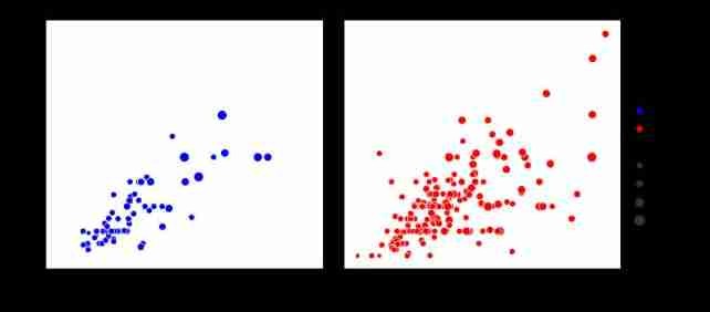
You can see , Tipping is positively correlated with consumption , That's accurate to different dates , What's the difference ? Although the colors in the above figure are distinguished, they are not obvious ,
seaborn The classification variables can be drawn into different subgraphs , As shown in the figure below :
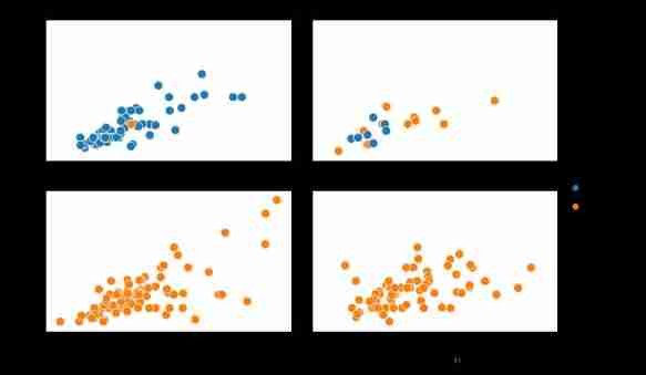
sns.relplot(x="total_bill", y="tip", data=tips,
hue="time", # Color to time Variable classification
col="day", # according to day Variables are listed
col_wrap=2, # Each row 2 A classification
s=100, # Scatter size ( come from plt.scatter Parameters of )
height=3,aspect=1.5)# Image size and horizontal / vertical ratio of each axis
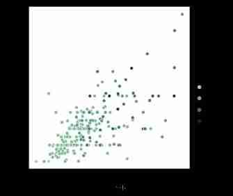
Of course , The size can also be used to show the size of variables
sns.relplot(x="total_bill", y="tip", data=tips,
hue="time", size="size",
palette=["b", "r"],
sizes=(30, 120),# size Size according to the minimum 20 Maximum 120 Distribution
col="time")# according to time Dissection
Of course, you can also set points to different shapes to distinguish categories , However, it is not recommended to express a variable and a shape separately , Because the difference of shape is not very obvious , Recommended for use with color .
sns.relplot(x='total_bill',y='tip',data=tips,
hue='smoker',style='smoker',s=50)

Color can show both discrete variables , You can also show continuous variables , You can also customize the palette
sns.relplot(x='total_bill',y='tip',data=tips,
hue='size',palette='ch:r=-.5,l=.75')
use relpot Drawing a line graph is actually right lineplot() Function access , therefore lineplot All parameters of can be used in this . alike ,scatterplot() The parameter settings of the function are almost the same .
*seaborn.lineplot(x=None, y=None, hue=None, size=None, style=None, data=None, palette=None, hue_order=None, hue_norm=None, sizes=None, size_order=None, size_norm=None, dashes=True, markers=None, style_order=None, units=None, estimator=‘mean’, ci=95, n_boot=1000, sort=True, err_style=‘band’, err_kws=None, legend=‘brief’, ax=None, *kwargs)
fmri = sns.load_dataset("fmri")
print(fmri.head())
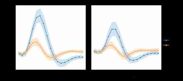
g = sns.relplot(x="timepoint", y="signal", data=fmri,
hue="event", ,
col="region",
markers=True,dashes=False,# Add tag , Forbidden dotted line
kind="line")
 subject timepoint event region signal
0 s13 18 stim parietal -0.017552
1 s5 14 stim parietal -0.080883
2 s12 18 stim parietal -0.081033
3 s11 18 stim parietal -0.046134
4 s10 18 stim parietal -0.037970
lineplot() By default x Sort by number , You can also ban .ci=None To prohibit . Of course, the confidence interval can also be replaced by the standard deviation ci="sd"sns.relplot(x="timepoint", y="signal",
data=fmri,sort=False, # No right x Sort
kind="line",ci=False) # No confidence interval
To turn off aggregation completely , It can be set like this estimator=None, But when the data has multiple observations at each point , May have strange effects
sns.relplot(x="timepoint", y="signal", estimator=None, kind="line", data=fmri)
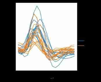
Sometimes we need to measure the same problem repeatedly and compare . that seaborn It can also be drawn separately
sns.relplot(x="timepoint", y="signal", hue="region",
units="subject", estimator=None,
kind="line", data=fmri.query("event == 'stim'"))
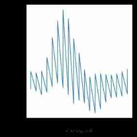
Line diagrams are often used to visualize data related to actual dates and times . These functions pass data in the original format to the underlying matplotlib function , So they can take advantage of matplotlib Ability to format dates in scale labels . But all formatting must be done in matplotlib Layer for , You can refer to matplotlib Documentation to see how it works :
fig = plt.figure(figsize=(8,6))
df = pd.DataFrame(dict(time=pd.date_range("2017-1-1", periods=500),
value=np.random.randn(500).cumsum()))
g = sns.relplot(x="time", y="value", kind="line", data=df)
g.fig.autofmt_xdate() # When X When the axis is in time format , Rotate in this way to avoid overlap .
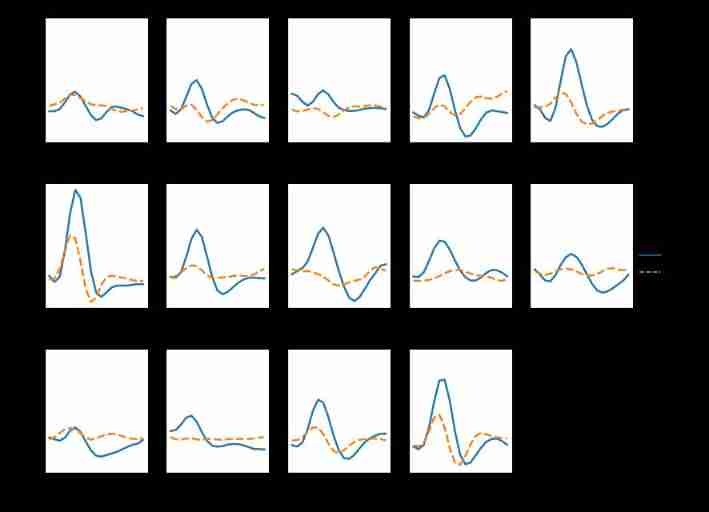
If you want to check the effect of multiple categories of variables , It's best to put it on a column .
sns.relplot(x="timepoint", y="signal", hue="event", ,
col="subject", col_wrap=5,
height=3, aspect=.75, linewidth=2.5,
kind="line", data=fmri.query("region == 'frontal'"))
Next article , We discuss seaborn Visualization of linear relationships in