When we do data analysis , It's hard to avoid using images to represent what you want to show , Next, write about demo To show various diagrams :
By default, all the following operations are imported first numpy、pandas、matplotlib、seaborn
import numpy as np
import pandas as pd
import matplotlib.pyplot as plt
import seaborn as sns
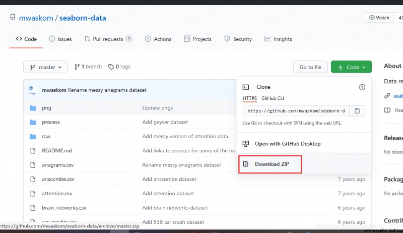
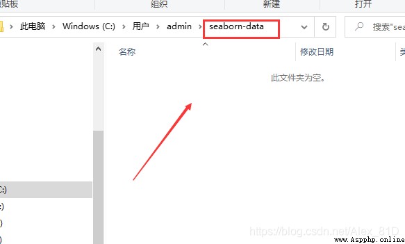
Data source address :github Address :https://github.com/mwaskom/seaborn-data
Unzip the file , Drag in seaborn-data In the folder
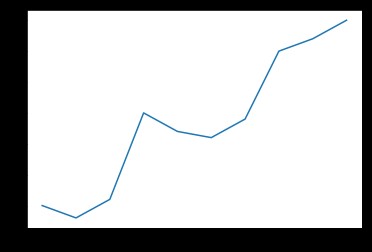
A line chart can be used to show the trend of data over time
x = [2010, 2011, 2012, 2013, 2014, 2015, 2016, 2017, 2018, 2019]
y = [5, 3, 6, 20, 17, 16, 19, 30, 32, 35]
plt.plot(x, y)
plt.show()
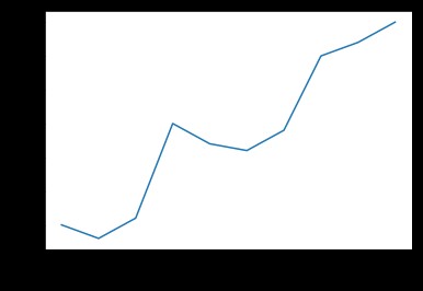
df = pd.DataFrame({'x': x, 'y': y})
sns.lineplot(x="x", y="y", data=df)
plt.show()
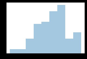
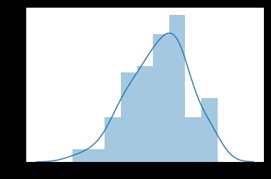
Histogram is a common view , It divides the abscissa into a certain number of cells , Then use rectangular bars in each cell (bars) Show the value of the interval
a = np.random.randn(100)
s = pd.Series(a)
plt.hist(s)
plt.show()

sns.distplot(s, kde=False)
plt.show()
sns.distplot(s, kde=True)
plt.show()
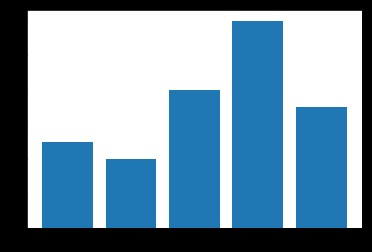
The bar chart can help us see the characteristics of the category . In the bar chart , The length of the bar indicates the frequency of the category , Width means category .
x = ['Cat1', 'Cat2', 'Cat3', 'Cat4', 'Cat5']
y = [5, 4, 8, 12, 7]
plt.bar(x, y)
plt.show()
plt.show()
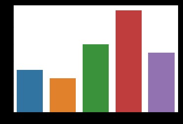
x = ['Cat1', 'Cat2', 'Cat3', 'Cat4', 'Cat5']
y = [5, 4, 8, 12, 7]
plt.barh(x, y)
plt.show()

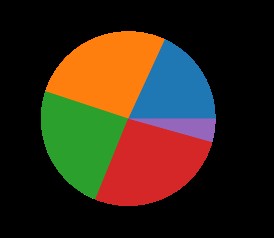
nums = [25, 37, 33, 37, 6]
labels = ['High-school','Bachelor','Master','Ph.d', 'Others']
plt.pie(x = nums, labels=labels)
plt.show()
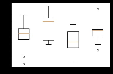
The box diagram consists of five numerical points : Maximum (max)、 minimum value (min)、 Median (median) And the upper and lower quartiles (Q3, Q1).
It can help us analyze the difference of data 、 Dispersion and outliers, etc .
# Generate 0-1 Between 10*4 Dimensional data
data=np.random.normal(size=(10,4))
lables = ['A','B','C','D']
# use Matplotlib Draw a box diagram
plt.boxplot(data,labels=lables)
plt.show()
# use Seaborn Draw a box diagram
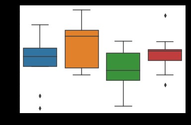
df = pd.DataFrame(data, columns=lables)
sns.boxplot(data=df)
plt.show()
Heat map , English name heat map, It's a matrix representation , The values of the elements in the matrix are represented by colors , Different colors represent different values of different sizes . Through color, we can know the value of a certain position directly .
data = np.array([[1,2,3],[4,5,6],[7,8,9]])
ax = sns.heatmap(data,annot=True)
bottom, top = ax.get_ylim()
ax.set_ylim(bottom + 0.5, top - 0.5)
plt.show()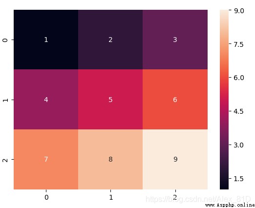
This requires data sets , Go to git Download it ,git Address :https://github.com/mwaskom/seaborn-data download seaborn-data file
flights = sns.load_dataset("flights")
data=flights.pivot('year','month','passengers')
sns.heatmap(data)
plt.show()
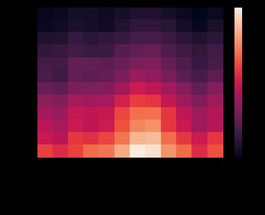
adopt seaborn Of heatmap function , We can observe different years , Changes in the number of passengers in different months , The lighter the color, the more passengers
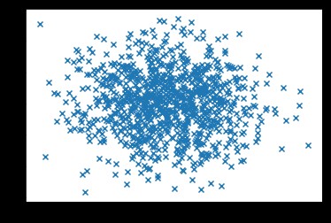
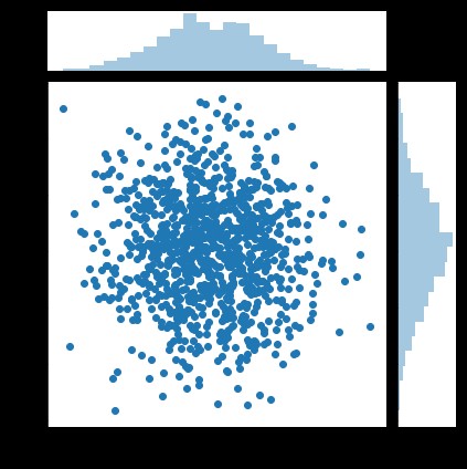
The English name of scatter chart is scatter plot, It shows the values of two variables in two-dimensional coordinates , It is very suitable to show the relationship between two variables .
N = 1000
x = np.random.randn(N)
y = np.random.randn(N)
plt.scatter(x, y,marker='x')
plt.show()
df = pd.DataFrame({'x': x, 'y': y})
sns.jointplot(x="x", y="y", data=df, kind='scatter');
plt.show()
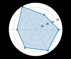
Spiders are a way to show one to many relationships , Make the significance of one variable relative to another clearly visible
labels=np.array([u" advance ","KDA",u" Existence ",u" Regiment war ",u" development ",u" Output "])
stats=[83, 61, 95, 67, 76, 88]
# Drawing data preparation , angle 、 The status value
angles=np.linspace(0, 2*np.pi, len(labels), endpoint=False)
stats=np.concatenate((stats,[stats[0]]))
angles=np.concatenate((angles,[angles[0]]))
# use Matplotlib Drawing spiders
fig = plt.figure()
ax = fig.add_subplot(111, polar=True)
ax.plot(angles, stats, 'o-', linewidth=2)
ax.fill(angles, stats, alpha=0.25)
# Set Chinese font
# font = FontProperties(fname=r"/System/Library/Fonts/PingFang.ttc", size=14)
# ax.set_thetagrids(angles * 180/np.pi, labels, FontProperties=font)
ax.set_thetagrids(angles * 180/np.pi, labels, fontproperties="SimHei")
plt.show()
Data source address :github Address :https://github.com/mwaskom/seaborn-data
Unzip the file , Drag in seaborn-data In the folder

The distribution of binary variables can see the relationship between two variables
tips = sns.load_dataset("tips")
tips.head(10)
# Scatter plot
sns.jointplot(x="total_bill", y="tip", data=tips, kind='scatter')
# Nuclear density map
sns.jointplot(x="total_bill", y="tip", data=tips, kind='kde')
#Hexbin chart
sns.jointplot(x="total_bill", y="tip", data=tips, kind='hex')
plt.show()
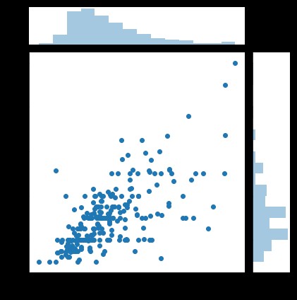
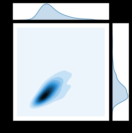
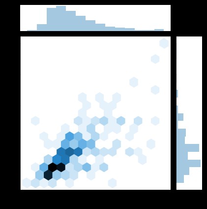
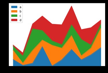
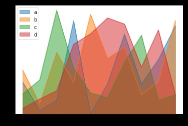
Area map is also called area map , Emphasize the degree to which the quantity changes over time , It can also be used to draw attention to the trend of gross value .
The stacked area diagram can also show the relationship between the part and the whole . Both line charts and area charts can be used to help us analyze trends , When the data set has a total relationship or you want to show the local and overall relationship , Use area charts for better choices .
df = pd.DataFrame(
np.random.rand(10, 4),
columns=['a', 'b', 'c', 'd'])
# Pile area diagram
df.plot.area()
# Area map
df.plot.area(stacked=False)
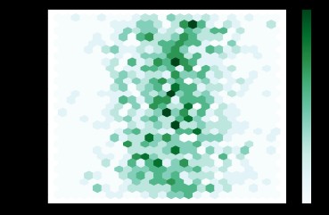
A hexagon graph gathers points in space into a hexagon , Then color the hexagon according to the values inside the hexagon .
df = pd.DataFrame(
np.random.randn(1000, 2),
columns=['a', 'b'])
df['b'] = df['b'] + np.arange(1000)
# Key parameters gridsize; It controls x The number of hexagons in the direction , The default is 100, The larger gridsize It means more , Smaller bin
df.plot.hexbin(x='a', y='b', gridsize=25)
This article is rewritten with reference to the following articles , Thank you, blogger
https://www.cnblogs.com/chenqionghe/p/12254085.html