pygal yes python Visualization package for , Just for Generate Can generate scalable Vector graphics file , For charts that need to be displayed on screens of different sizes , They are automatically scaled , To fit the viewer's screen .
If you plan to use charts online , Please consider using Pygal To generate them , So they will be beautiful when displayed on any device .
# The vector image is enlarged without distortion
(1) install pygal package
Linux and OSX System
pip install --user pygal
Windows System
python -m pip install --user pygal
【 Be careful 】: You may need to use commands pip3 instead of pip , If this still doesn't work , You may need to delete the flag –user .
To understand how to use Pygal What kind of chart can be created , Please check the chart type gallery : visit http://www.pygal.org/ , single click Documentation, Click again Chart types. Each example contains source code , Let you know how these charts are generated .
(2) Case simulation
【 Case needs 】: Use Pygal Simulate rolling dice .
【 Case simulation 】: throw 6 When making regular dice on the face , The possible results are 1~6 spot , And the probability of each result is the same . However , If you roll two dice at the same time , Some points will appear more likely than others . To determine which points are most likely to appear , We will generate a data set that represents the result of the dice , And draw a graph according to the result .
【 Case realization 】:
# establish Die class
class Die():
""" Represents a class of dice """
def __init__(self, num_sides=6):
""" Dice default to 6 Noodles """
self.num_sides = num_sides
def roll(self):
"""" Returns a message located at 1 And the number of dice faces """
return randint(1, self.num_sides)
Simulate rolling dice
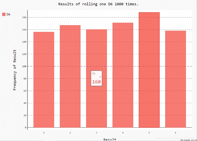
Situation 1 、 Throw one 6 Face dice , The results of the analysis
# Throw one 6 Face dice
def roll_die():
# Instance a dice object , The number of faces is the default
die = Die()
# Roll the dice a few times , And store the results in a list
results = []
for roll_num in range(1000):# Circular throw 100 Time
result = die.roll()
results.append(result)# Store the results in the results list
# Add range(end) The default from the 0 Start , namely 0-end-1 contain 0, Not included end
# Analyze the result of the dice results Result set
#frequencies={}
frequencies =[]
for value in range(1, die.num_sides + 1):
frequency = results.count(value)# Count the frequency , Each number appears several times
frequencies.append(frequency)# Save list
#frequencies[value]=frequency # Deposit in dictionary
print(frequencies)
# Draw graph analysis according to the results visualization
#1、 Histogram ( Bar chart ) pygal.Bar() Create a bar graph instance
hist = pygal.Bar() # Create a bar graph instance
# Draw the title
hist.title = "Results of rolling one D6 1000 times."
# draw x Axis labels
hist.x_labels = ['1', '2', '3', '4', '5', '6']
# draw x Axis title
hist.x_title = "Result"
# draw y Axis title
hist.y_title = "Frequency of Result"
# Use add() Add a series of values to the chart , Pass it the label you want to assign to the added value , There is also a list , It contains the values that will appear in the chart
hist.add('D6', frequencies) #D6 Is the label ( legend ) frequencies Data list
# Render the chart as svg file , The file extension must be .svg
hist.render_to_file('single_roll.svg')
# Be careful :Pygal Make this chart interactive : If you point your mouse at any bar in the chart , You will see the data associated with it .
# problem : Operating time , It is found that there is no data displayed when the mouse moves over the picture .
# reason :Pygal Version is too old , And the currently used python Version incompatible , Or the browser version used is too low
# solve : to update Pygal pip install --upgrade pygal
【small tips】:
(1) Create a bar chart
【 grammar 】:chart=pygal.Bar(style=**,x_label_rotation= angle ,show_legend=False/True)
Be careful :chart yes pygal Example ,Bar Initial must be capitalized ;style For the style ,x_label_rotation Rotation Angle ( Clockwise rotation );show_legend Show legend or not .
(2)svg
Is a scalable vector image graphics file format , Files in this format have clear edges 、 Small file size 、 Convenient transmission , Therefore, it is commonly used in web page design .
【 Result display 】:
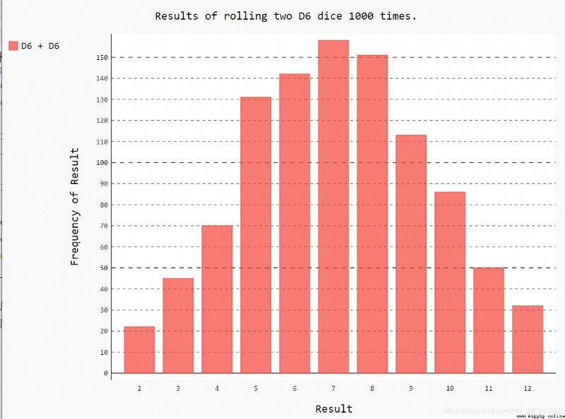
Case 2 、 Simultaneous throw 2 individual 6 Face dice
# Throw two at the same time 6 Face dice
def double_roll():
# Create two D6 dice
die_1 = Die()
die_2 = Die()
# Roll the dice many times , And store the results in a list
results = []
for roll_num in range(1000):
result = die_1.roll() + die_2.roll()
results.append(result)
# The results of the analysis
frequencies = []
max_result = die_1.num_sides + die_2.num_sides
for value in range(2, max_result+1):
frequency = results.count(value)
frequencies.append(frequency)
# Visualization results Draw histogram
hist = pygal.Bar()
hist.title = "Results of rolling two D6 dice 1000 times."
hist.x_labels = ['2', '3', '4', '5', '6', '7', '8', '9', '10', '11', '12']
hist.x_title = "Result"
hist.y_title = "Frequency of Result"
hist.add('D6 + D6', frequencies)
hist.render_to_file('double_roll.svg')
【 analysis 】: The algorithm is the same as rolling a dice , Just the same algorithm , Two dice instances have been created .
【 Result display 】:
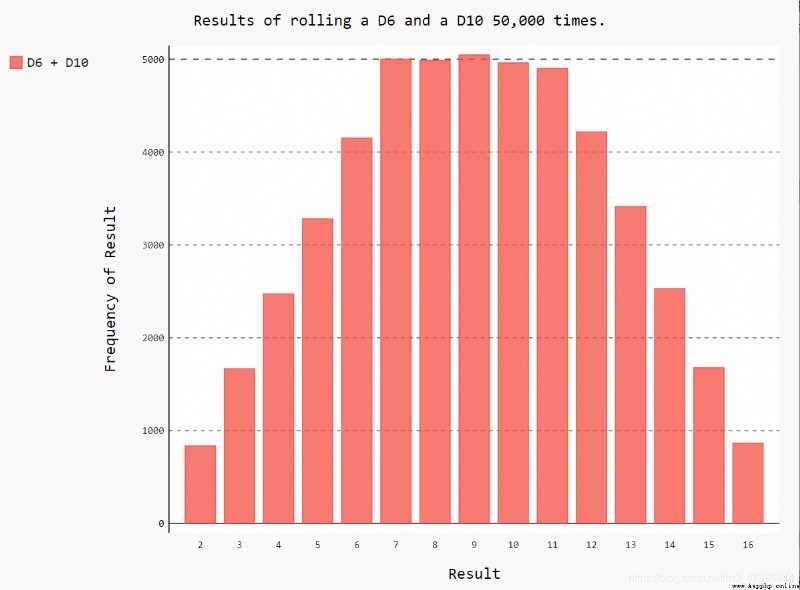
Situation 3 、 Roll two dice with different numbers of sides at the same time
def double_diff():
# Instantiate a 6 Face dice and a 10 Face dice
die_1 = Die()
die_2 = Die(10)
# Roll the dice many times , And store the results in a list
results = []
for roll_num in range(50000):
result = die_1.roll() + die_2.roll()
results.append(result)
# The results of the analysis To complete a data frequency statistics function
frequencies = []
# Calculate the maximum number of possible results
max_result = die_1.num_sides + die_2.num_sides
for value in range(2, max_result + 1):# All possible result items
frequency = results.count(value)# frequency statistic
frequencies.append(frequency)
# Visualization results Draw histogram
hist = pygal.Bar()
# Add image title
hist.title = "Results of rolling a D6 and a D10 50,000 times."
hist.x_labels = ['2', '3', '4', '5', '6', '7', '8', '9', '10', '11', '12', '13', '14', '15', '16']
hist.x_title = "Result"
hist.y_title = "Frequency of Result"
hist.add('D6 + D10', frequencies)
# Save as svg Vector format
hist.render_to_file('double_diff_roll.svg')
【 analysis 】: The algorithm is the same as rolling a dice , Just the same algorithm , Two dice instances have been created .
【 Add 】:
First we will show 3 Speciation hist.x_labels List method :
Law 1 、for Cycle generation
 #for Cycle generation hist.x_labels list
xs = []
for value in range(2, max_result + 1):
xs.append(value)
hist.x_labels = xs
Law two 、 List parsing
 # List parsing
xs=[value for value in range(2,max_result+1)]
hist.x_labels = xs
Law three 、 Direct assignment
hist.x_labels = ['2', '3', '4', '5', '6', '7', '8', '9', '10', '11', '12', '13', '14', '15', '16']
Realization hist.x_labels The list is automatically generated , The method can be extended to hist.y_labels And the generation of other lists
==》python You can use these three methods to generate a list