The first 1 Turn off :Scatter: Scatter plot ( One )
Programming requirements
Code
Test instructions
The first 2 Turn off :Scatter: Scatter plot ( Two )
Programming requirements
Code
Test instructions
The first 3 Turn off :Scatter: Scatter plot ( 3、 ... and )
Programming requirements
Code
Test instructions
The first 1 Turn off :Scatter: Scatter plot ( One ) Programming requirementsAccording to the above , Add code to the editor on the right , Plot a scatter plot of the given data , requirement :
The canvas size is initialized to wide 1600 Pixels , high 1000 Pixels
X The axis data is set to x_data
add to Y Axis data . Set the series name to null , Data usage y_data, The size of the tag is set to 20, Do not display labels
X The axis type is set to numeric axis , And show split lines
Y The axis type is set to numeric axis , And display the division line and the axis scale
Don't show the prompt box
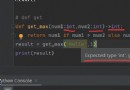
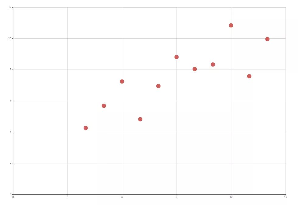
Codefrom PreTest import *from pyecharts import options as optsfrom pyecharts.render import make_snapshotfrom snapshot_phantomjs import snapshotfrom pyecharts.charts import Scatterdata = [ [10.0, 8.04], [8.0, 6.95], [13.0, 7.58], [9.0, 8.81], [11.0, 8.33], [14.0, 9.96], [6.0, 7.24], [4.0, 4.26], [12.0, 10.84], [7.0, 4.82], [5.0, 5.68],]data.sort(key=lambda x: x[0])x_data = [d[0] for d in data]y_data = [d[1] for d in data]def scatter_chart() -> Scatter: # ********* Begin *********# scatter = ( Scatter(init_opts=opts.InitOpts(width="1600px", height="1000px")) .add_xaxis(x_data) .add_yaxis("", y_data, symbol_size=20 ) .set_series_opts( label_opts=opts.LabelOpts(is_show=False) ) .set_global_opts( tooltip_opts=opts.TooltipOpts(is_show=False), xaxis_opts=opts.AxisOpts( type_="value", splitline_opts=opts.SplitLineOpts(is_show=True) ), yaxis_opts=opts.AxisOpts( type_="value", splitline_opts=opts.SplitLineOpts(is_show=True), axistick_opts=opts.AxisTickOpts(is_show=True) ) ) ) # ********** End **********# return scattermake_snapshot(snapshot, scatter_chart().render("Result/render.html"), 'StudentAnswer/student_answer.png') # Output pictures make_snapshot(snapshot, scatter_base(x_data, y_data).render(), "StandardAnswer/task1/standard_answer_1.png") Test instructions The platform will run the code you write to draw , And compare it with the expected picture . The expected results are as follows :
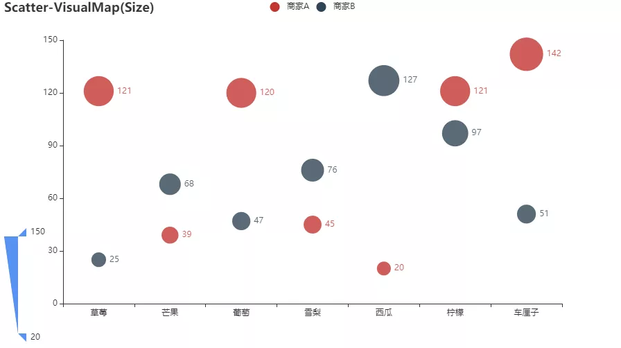
According to the above , Add code to the editor on the right , Use the given data to draw the corresponding scatter diagram , requirement :
X Axis data items use data_x
Add two groups Y Axis data .
The first set of series names is set to “ merchants A”, Data usage data_y_1
The second set of series names is set to “ merchants B”, Data usage data_y_2
Set the title to “Scatter-VisualMap(Size)”
Visual mapping transition type selection “size”, The maximum value is set to 150, The minimum value is set to 20
Codefrom PreTest import *from pyecharts import options as optsfrom pyecharts.render import make_snapshotfrom snapshot_phantomjs import snapshotfrom pyecharts.charts import Scatterfrom pyecharts.faker import Fakerdata_x = Faker.choose()data_y_1 = Faker.values()data_y_2 = Faker.values()def scatter_chart() -> Scatter: # ********* Begin *********# scatter = ( Scatter() .add_xaxis(data_x) .add_yaxis(" merchants A",data_y_1) .add_yaxis(" merchants B",data_y_2) .set_global_opts( title_opts=opts.TitleOpts(title="Scatter-VisualMap(Size)"), visualmap_opts=opts.VisualMapOpts(is_show=True,type_='size',min_=20,max_=150) ) ) # ********** End **********# return scattermake_snapshot(snapshot, scatter_chart().render("Result/render.html"), "StudentAnswer/student_answer.png") # Output pictures make_snapshot(snapshot, scatter_visual(data_x, data_y_1, data_y_2).render(), "StandardAnswer/task2/standard_answer_2.png") Test instructions The platform will run the code you write to draw , And compare it with the expected picture . The expected results are as follows :
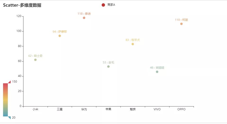
According to the above , Add code to the editor on the right , Use the given data to draw the corresponding scatter diagram , requirement :
X Axis data items use data_x
Y Axis data items use data_y, The series name is set to “ merchants A”, And use JsCode Format label ( See the end of the text for the specific format )
The title is set to “Scatter- Multidimensional data ”
use JsCode Format prompt box text ( See the end of the article )
The visual mapping type is set to color , The maximum value is set to 150, The minimum value is set to 20, Component mapping dimension is 1
Codefrom PreTest import *from pyecharts import options as optsfrom pyecharts.render import make_snapshotfrom snapshot_phantomjs import snapshotfrom pyecharts.charts import Scatterfrom pyecharts.faker import Fakerfrom pyecharts.commons.utils import JsCodedata_x = Faker.choose()data_y = [list(z) for z in zip(Faker.values(), Faker.choose())]def scatter_chart() -> Scatter: # ********* Begin *********# scatter = ( Scatter() .add_xaxis(data_x) .add_yaxis( " merchants A", data_y, label_opts=opts.LabelOpts( formatter=JsCode("""function(params){return params.value[1] +' : '+ params.value[2];}""") ) ) .set_global_opts( title_opts=opts.TitleOpts(title="Scatter- Multidimensional data "), visualmap_opts=opts.VisualMapOpts(is_show=True,type_='color',min_=20,max_=150,dimension=1), tooltip_opts=opts.TooltipOpts( formatter=JsCode("""function (params) {return params.name + ' : ' + params.value[2];}""") ) ) ) # ********** End **********# return scattermake_snapshot(snapshot, scatter_chart().render("Result/render.html"), 'StudentAnswer/student_answer.png') # Output pictures make_snapshot(snapshot, scatter_multi(data_x, data_y).render(), "StandardAnswer/task3/standard_answer_3.png") Test instructions The platform will run the code you write to draw , And compare it with the expected picture . The expected results are as follows :
That's all Python+Pyecharts To achieve the details of the drawing of the scatter diagram , More about Python Pyecharts For scatter chart information, please pay attention to other relevant articles on software development network !
 Computer graduation design + the Python django movie recommendation system based on collaborative filtering algorithm (source + + mysql database system + Lw document)
項目介紹隨著社會的發展,人們生活水平的提高,Watching